
John Hurrell – 22 February, 2012
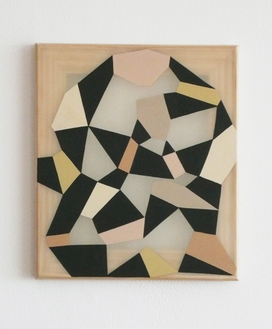
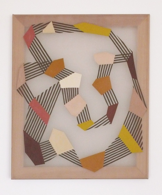
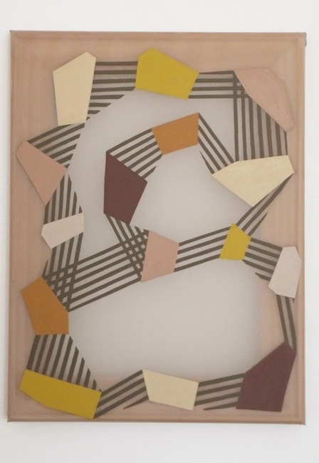
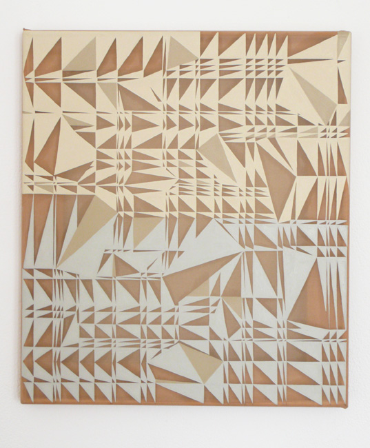
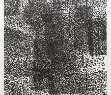
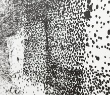
Close inspection shows these works to be hand painted without an industrial finish. There is a slight wobble to the line edge and hint of individual brush strokes in the resulting surface relief. Foote's images are not clinical but have an attractive artisanal quality.
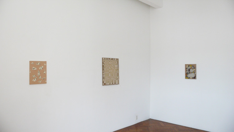
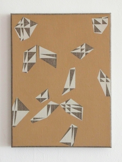
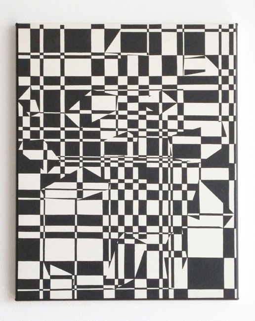
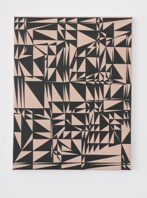
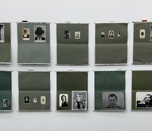
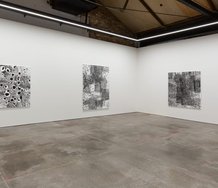
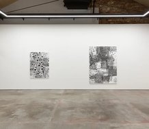
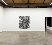
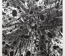
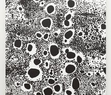
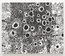
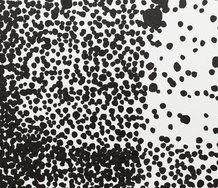
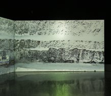
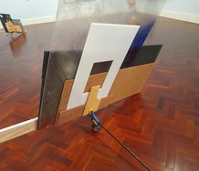
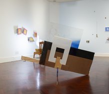
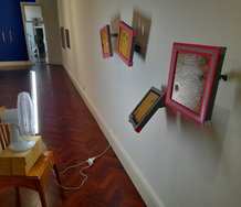
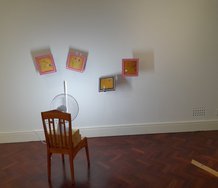
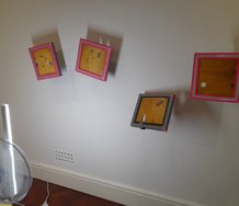
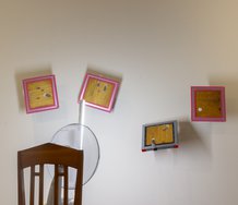
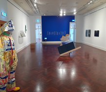
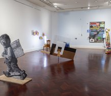
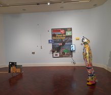
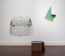
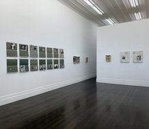
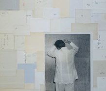
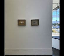
The twelve paintings Selina Foote presents here continue her interest in using portraits from the beginning of modernism to generate two varieties of small work. One has fields of quivering acute-tipped triangles painted on fine-grained Belgian linen, the other hovering polygons linked by parallel lines placed on stretched translucent silk made transparent through the application of size.
The triangular patterned ones look like collaged rearrangements of early Bridget Riley works, but with greater variation in triangle size. These works seem to ripple like thousands of spiky yachts crammed into a bay, or roll in a vertically scrolled motion with trembling sharpened tips.
Foote’s linked polygons on the other hand, usually rendered in ochre or oxide colours, seem to allude to Mel Bochner in their shapes, Kenneth Martin in their parallel lines, and Sigmar Polke in their use of translucency. Their plastic-like silk exploits the shadows cast on the wall behind the paint and the wood grain of the stretchers, while the softness of the faint grey-brown silk makes the configurations seem like hunched over figures or loosely tied knots. Some hybrids exist as well, where the flickering triangles are clear so that the wall is visible behind them, and opacity and translucency are juxtaposed.
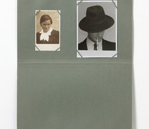
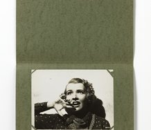
She has based these works on a painting Manet created in 1862 of a bustling crowd of people jammed into the Tuileries Gardens in Paris. Included in his rendered scene are portraits of many of his artist friends and a self portrait. Using a book of reproductions with enlarged details of these, Foote has constructed her abstractions by formulating a series of rules and processes, extending certain vectors and flat angular fragments within each chosen visage, and repeating key colours.
Close inspection shows these works to be hand painted without an industrial finish. There is a slight wobble to the line edge and hint of individual brush strokes in the resulting surface relief. Foote’s images are not clinical but have an attractive artisanal quality.
The stretching of the conceptual umbilical cord between generative Manet detail and completed Foote painting is the obvious question here, a teasing out of an origin that very soon is not detectable in the finished product. Firstly the artist has left no notebooks, documentation or diagrams explaining the details to gallery visitors so they have to take the word of gallerists and curator/writers who have been to her studio. Secondly, even if Foote did present contextual material for her audience elaborating on her method, would it really matter? Is the result on the walls so compelling that you are persuaded the way she makes these paintings is important, because it might not necessarily be the case?
Well obviously it is, but I think relying on mystification or hearsay is a bad thing, and that contextual material should be at hand near the works for people to look at, but not be part of the show. Of course we have the information at hand about Manet which I’ve just discussed, but ultimately the painted objects have to generate a fascination so that you are keen to know more detail about the process.
In a way, Foote is halfway between Simon Ingram and Dane Mitchell, one practice where the production is often demonstrated live in a gallery, and the other where we have to accept the word of the artist in terms of claims about magical spells etc. She could of course fake it, just make beautiful little geometric abstractions - only concentrating on compositional variations, and we’d be none the wiser - but the notion of beginning with a nineteenth century portrait and ending up with a zigzagging striped configuration (exemplifying modernism) intrigues. A rivetting metamorphosis.
John Hurrell
Recent Comments
John Hurrell
I'm baffled,fellas. Abts is self reflexive, her product generated from within each separate canvas. Foote I think is closer to ...
simon glaister
At first glance of these images I actually thought there was an Abts show at Crockford.
Andrew Paul Wood
That's not really a defense, John. Admittedly I can't find the best images for comparison, but I think you're wrong ...
 Advertising in this column
 Two Rooms presents a program of residencies and projects
This Discussion has 20 comments.
Comment
Erin Driessen, 10:28 a.m. 22 February, 2012 #
Hi John,
I agree that contextual material would really add to the experience of these works. I personally don't find them fascinating enough on their own; I wouldn't search out her process or inspiration just by looking at these, even though I like most of them. However, my curiosity would be sparked by a table of material documenting the portrait connection. I think it would create a whole new train of thought on modernism and its different stages. Context and process are essential here and I think Foote could throw it all out there in a really constructive way.
John Hurrell, 10:43 a.m. 22 February, 2012 #
Yes I tend to get twitchy when exhibitions in municipal galleries for example have vitrines of contextual material (like sources, tools, raw materials etc) in the same space as the art. Sometimes it gets fetishised or becomes the equivalent of the art.
On the other hand, viewers should never take curators, critics or gallery staff at their word. It is important to fully understand the process by looking at the artist's methods directly.
Erin Driessen, 10:58 a.m. 22 February, 2012 #
Yea, good point.
It would be important not to have it laid out in such a way that the viewer is confronted with the contextual material first, before deciding whether they want to or not. Maybe if the gallery had pamphlets explaining the context, that were marked as such, so the viewer could decide for themselves if they want to look at it before or after viewing the works, or not at all. Even if I chose not to look at the context first and then was underwhelmed by the work itself, I would know there was more info that might enhance the work for me. Dunno...something like that...
John Hurrell, 12:47 p.m. 22 February, 2012 #
That 'enhancing' aspect implies that there is a separation of concept from form. To which I agree - in fact I think the 'idea' is often grossly over-rated.
Why? Because where is the carrot or bait in the work that makes you stick around, that awakes your curiosity? Could be the dynamics of the image. Could be the underpinning premise. But a brilliant idea with crappy visual presentation has more of an uphill battle to engage than vice versa.
Erin Driessen, 1:30 p.m. 22 February, 2012 #
But what about an idea that has not good or bad visual expression, but NO visual expression? There would be no way I'd see what she was apparently trying to do here unless I'd heard or read about it. I'd think, "Nice colours. Kinda modernist. Mosaic is over, though." Which sucks, because knowing the idea behind it, I really really like them. The separation of concept from form is too wide here, I think, especially for a general art audience.
Erin Driessen, 1:33 p.m. 22 February, 2012 #
Okay - it DOES have visual expression... But you can hopefully see what I'm getting at.
Erin Driessen, 1:51 p.m. 22 February, 2012 #
Well, we know a potentially good critical point with crappy linguistic expression definitely fights an uphill battle, ha.
John Hurrell, 2:05 p.m. 22 February, 2012 #
We all know a lot of art needs an essay by a curator/critic to make its point apparent, it is not apparent on its own. That to me is weaker than art where the idea can be visually detected (outside written language) in the work itself. That is a form of heresy these days - for writing is the continually perpetuated backbone of the academic/university ideology, it sustains the industry.
Erin Driessen, 2:08 p.m. 22 February, 2012 #
Agreed.
Veronica Crockford-Pound, 3:50 p.m. 22 February, 2012 #
Hi John and Erin,
The information print-out (which talks of Selina Foote's process in general and also includes a brief snippet from John's previous review of her work in our group show "Painting") is usually found next to the exhibition list. We endeavour to make sure that the print-outs are always there for viewers so we apologise for our oversight.
Many thanks,
Veronica
Sue Crockford Gallery
John Hurrell, 4:37 p.m. 22 February, 2012 #
No need at all to apologise, Veronica. I got one of those sheets. I'm really referring to a detailed explanation, so that the shift from Manet's imagery to Selina's abstractions is grasped as a series of stages. As I said, I'm appreciate how the presentation of such source material might interfere with the display of the end results, and that it should be kept well to one side. Maybe it is up to visitors to ask and not wait to be offered.
Andrew Paul Wood, 6:28 p.m. 22 February, 2012 #
Why do i get this sense of numbing deja vu.. Oh wait, it's because I have a copy of Vitamin P. Perhaps
John Hurrell, 6:43 p.m. 22 February, 2012 #
Cut the innuendo, Andrew. If you have something to say, let's hear it.
Andrew Paul Wood, 12:13 a.m. 23 February, 2012 #
Fine. It looks to me like a cynical, recherche and unimaginative re-hash of mid 1990s "bad painting" right down to the muddy palette and pseudo-primitive faux-modernist geometric abstraction. If they haven't knocked my house down yet, I'll put together a list of artists for you to compare and contrast.
The work is utterly bereft of original thought, and it's telling that you can find so little to say about it that you have to resort to talking about what it's made of. It looks like the artist just thumbed through said Vitamin P, picked two or three artists, and started knocking off pastiches without any real elaboration or revelation. Second hand is interesting, third hand is just boring.
John Hurrell, 1:13 a.m. 23 February, 2012 #
I await your list with interest.
Andrew Paul Wood, 3:55 p.m. 23 February, 2012 #
I'm disappointed - I was hoping to find a bit more synthesis among sources, however it pretty much boils down to two names for me.
The straight abstracts are heavily, HEAVILY indebted in terms of palette and composition to the German painter Tomma Abts.
http://en.wikipedia.org/wiki/Tomma_Abts
The pseudo-op art is so similar to some of Sarah Morris' work as to be scary
http://en.wikipedia.org/wiki/Sarah_Morris
John Hurrell, 5:06 p.m. 23 February, 2012 #
You're clutching at straws,Andrew. Foote's work is hugely different.
Andrew Paul Wood, 5:49 p.m. 23 February, 2012 #
That's not really a defense, John. Admittedly I can't find the best images for comparison, but I think you're wrong there, especially in the case of Sarah Morris.
simon glaister, 3:50 p.m. 25 February, 2012 #
At first glance of these images I actually thought there was an Abts show at Crockford.
John Hurrell, 5:39 p.m. 25 February, 2012 #
I'm baffled,fellas. Abts is self reflexive, her product generated from within each separate canvas. Foote I think is closer to (say) Simon Morris, using rules elucidated before the beginning to generate from the source portrait the finished abstraction. Worlds apart.
Participate
Register to Participate.
Sign in
Sign in to an existing account.