John Hurrell – 3 July, 2010
Lyall's method is not nearly so dry, technically uncomplicated, or extreme as Levine's (it is more conceptually convoluted) but there are connections.
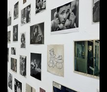
This exhibition of John Lyall’s shows the conceptual strategies formulated in the depths of an artist’s imagination which, it might be argued, end up exuding a sense of being removed from the palpable realm of ordinary everyday things in its rarefication. It reminds me of the work of Sherrie Levine, a controversial American photographer in the early eighties who gained rapid fame, through critics like Craig Owens, via her use of techniques of appropriation. Using a catalogue, she photographed a number of works by the famous depression era photographer Walker Evans, and claimed them as her own (the show was called After Walker Evans) - raising all sorts of issues about identity, time, politics of representation, and of course copyright. Needless to say, many of these famous images (identical to Evans visually, but now linked to Levine too) got legally confiscated by the Walker Evans estate.
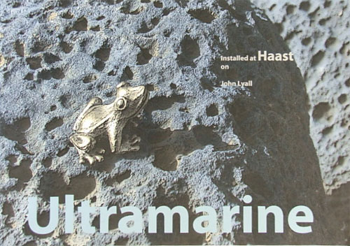
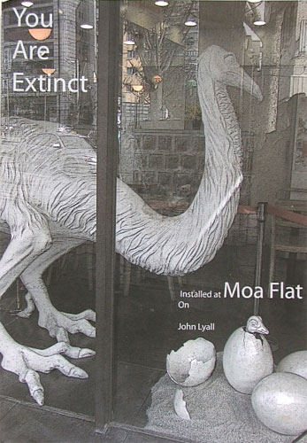
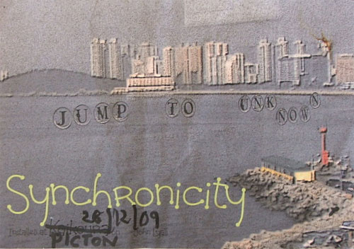
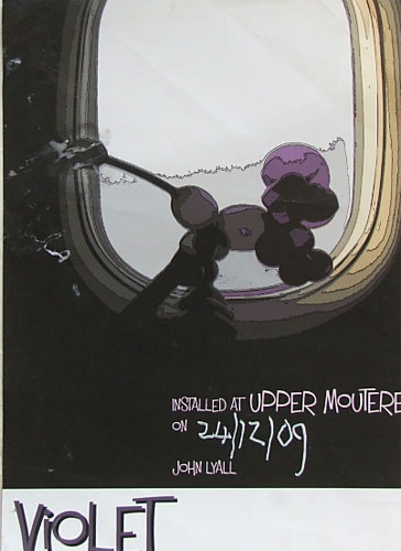
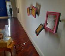
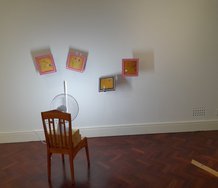
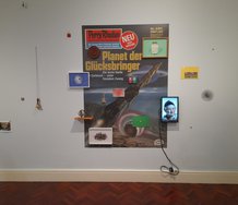
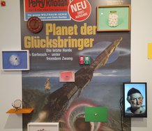
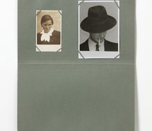
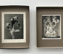
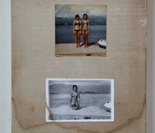
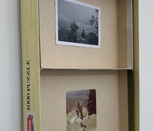
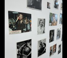
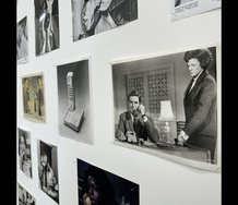
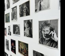
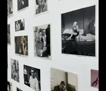
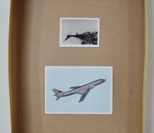
Lyall’s method is not nearly so dry, technically uncomplicated, or extreme as Levine’s (it is more conceptually convoluted) but there are connections. He has constructed a series of two dozen posters for fake exhibitions that never occurred, using for imagery, shots from his own history of performance art or snaps he has taken during different trips around the world (of city scenes, or things he has picked up and put in his pocket) - this travelling including a tour around the South Island preparing a book with his partner Claudia Bell.
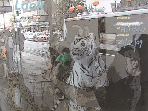
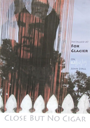
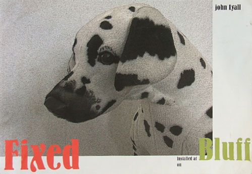
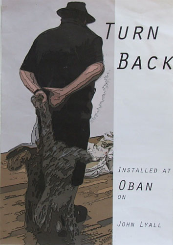
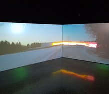
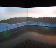
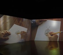
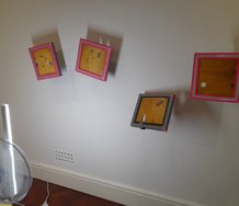
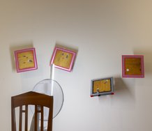
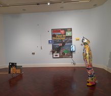
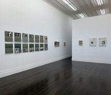
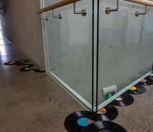
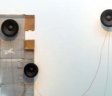
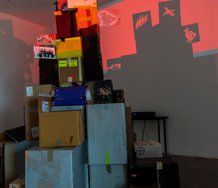
He made the twenty-four posters for brief installations to be documented on specific tourist sites around the South Island and Stewart Island last December. They were planned with those locations in mind, places he had visited before - with the references in the digitally manipulated imagery constructed accordingly - and the name of the site and Lyall’s name printed on the poster in anticipation. Then he returned to those sites, and dated the newly installed posters as planned - while being videoed by Claudia.
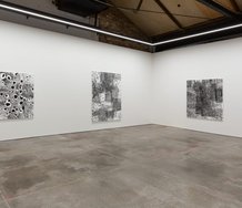
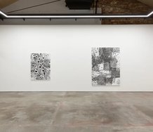
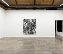
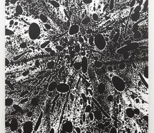
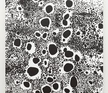
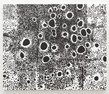
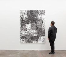
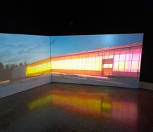
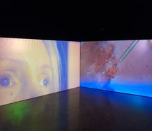
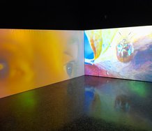
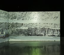
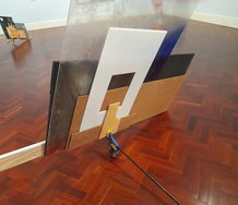
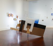
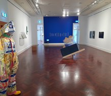
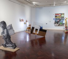
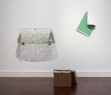
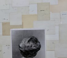
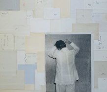
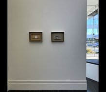
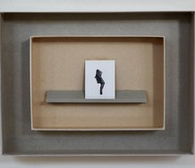
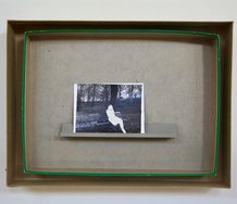
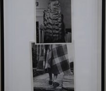
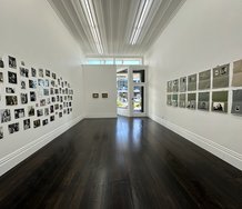
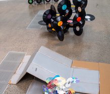
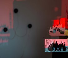
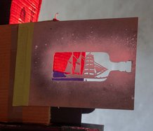
In Jane Sanders’ space we see the video of the trip, the original posters in two side rooms, and in the main gallery, framed, enlarged and unique versions of those posters with the incorporated date blended into the image. That blending intrigues, and is the link with Levine.
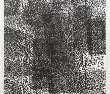
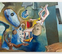
The date declares that John Lyall came to that stated spot and put the poster up there - much like Levine’s image says ‘I photographed here a work by Walker Evans.’ Both have a photographic layering involved, a compression. Lyall is mainly preoccupied with geographic spatial compression but I think the chronological aspect is more interesting. He is sort of halfway between On Kawara and his declarative date paintings about being alive, and Levine’s sandwiching of time through photography. Though the jamming of the handwritten date into the functional fabric of the poster is as much a declaration of place as time, and resonates against the origins of the different objects, self portraits, animals and people in the image, it also bounces against the various periods linked to them, the dates those earlier photographs were made.
That is if you care enough to want to find out. If you are attracted sufficiently to want to dig out the details, you can, but they are not self evident. There is no obvious pattern through which you can decipher the work. The ideas are not simply stated, visually. Unlike say other artists like Apple or Kawara.
In his recent NZ Herald interview with Adam Gifford, Lyall talks about himself as a conceptual artist who is indifferent to beauty (in favour of ugliness in fact), who won’t allow the ideas in his work to be upstaged by the images, but that is Duchampian anti-retinalism, and a lot of conceptual art doesn’t go that far. It is aware of beauty and considers the carrot of appearances to be useful for drawing audiences to ideas. Thus visual appeal is not spurned. However it is also not a dominant priority. This applies to Kosuth, Apple, Lewitt, Byars, Kawara and many others. Even makers of physically unseeable works like Robert Barry, or Walter de Maria (thinking of his buried, kilometer deep, brass rod) express their thoughts in beautiful verbal imagery or titles.
Despite his denials, Lyall has here made some beautiful and enigmatically compelling images - though admittedly not many. So he is partially right. He doesn’t want to visually seduce, believing (mistakenly I think) that his ideas do it on their own. He wishes his audience to read the notes on each work within the itemised catalogue that Jane Sanders his agent presents, to be enticed by that content, for they explain the personal significance of the imagery and the combinations, for him.
However gallery goers will only do that if they get excited by what they see. It is a double bind. That reality is the chicken before the egg. And of Lyall’s works that are ugly, through the processes of art history that ugliness might end up being transmuted or reinvented into beauty - being absorbed into it. But first it needs an audience to recognise it. To see a visual manifestation of an idea and come running.
John Hurrell
Recent Comments
Kim Finnarty
Oh well. I was trying to steer the tread to a discussion of the autonomous art work, which is the ...
John Hurrell
Well yes Nosferatu, you are obviously correct - and you'd have to be conversant with his practice to follow those ...
Nosferatu Smith
Perhaps we could ask him why. One of the connections I made with this new work is to a book ...
 Two Rooms presents a program of residencies and projects
 Advertising in this column
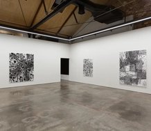
This Discussion has 13 comments.
Comment
Nosferatu Smith, 1:38 a.m. 5 July, 2010 #
There are other reasons why gallery goers will engage with a work. The reviewer argues that viewers will only engage if they are excited by what they see. However this is a simplistic assumption that (while it inarguably applies for a teenager with ADD or an Art Jade with a short attention span for other reasons to do with ennui and/or the lack of transferable status) does not acknowledge how or why we may spend time looking at new work from a mature artist with a consistent ouvre. Much of the coding in Lyalls work may be understood through his previous work, with or without the help of the catalogue notes.
All mature artists have personal motifs that can recurr in their work and may be understood by reflecting on their previous practice. Why should we assume the audience is always either untutored or merely pathologically bored?
I would argue that these images are not evidence the artist beleives his ideas are self explanatory, or as the reviewer puts it: "...believing (mistakenly I think) that his ideas do it on their own"
They may however be evidence that the artist mistakenly beleives that his audience (including his reviewer) would be passingly familiar with the previous work that gives this new work its dense compression, complex self- reflexivity and its context: theoretically, chronologically, geographically, methodologically (and perhaps also poetically and autobiographically) as the artist revisits known haunts armed with found, pilfered and reused images from other known haunts.
John Hurrell, 3:55 p.m. 5 July, 2010 #
In other words you think making art that consists largely of footnotes to the same artist's earlier art is ideationally interesting. I would argue that such incestuous hermeticism is not inspiring - least of all by itself. Work has to be visually appealing to make the viewer want to think about the artist's exhibition history and practice. Otherwise, why not just type out a list of references? Why be interested in images at all?
Nosferatu Smith, 8:30 p.m. 5 July, 2010 #
Thank you for replying, Mr Hurrell.
hmmn. I would not argue that every late career artist is automatically interesting, no. That would be absurd. (Although there is a certain filtering and tempering process that happens after a couple of decades of exhibition practice, there are arguably far fewer inherently un-interesting artists surviving 20 and 30 years into their careers than you will find at the average graduates show. I conceed they still do exist, I dont conceed that Lyall is one of them).
You seem to be creating an unnecessary polarity -so images are either completely interesting because they are visually appealing or they are not at all interesting? We either engage with them wholly or ignore them totally? I especially hope that you didnt mean charm or aesthetic harmony when you said visual appeal. Or did you mean scopophilia?
I disagree (totally) that visual appeal is necessary to make a viewer want to think more about the work. Point of fact one of Julian Dashper's works did consist solely of a typed list of references, would you seriously suggest that no-one found reasons to engage with Dashper's exhibition history and practice?
I have to ask: are you now saying that in your view that Lyalls current show is incestuously hermetic and consists only of footnotes to his previous work? This is a more damning statement than your previous observations where you appear to find it merely somewhat visually uninteresting.
For my part I was thinking very specifically about the references I can recognise in the work. Personally I enjoy most of Lyall's work that I have seen previously, and this may well have something to do with the sense of pleasure and recognition that I have seeing the traces of several different threads of his previous thinking. These things dont seem referentially closed or hermetic to me but do add a depth of context. Clearly a very subjective view. Then again I also love Dashper's work, for entirely different reasons.
My apologies for the long comment.
John Hurrell, 9:50 p.m. 5 July, 2010 #
The Dashper work you speak of would have been very carefully considered as a visual statement I imagine. Typewriter, print, scribble, write, or word processor? Lots of options in method and organisation that Julian would have thought about.
I agree with you about the dangers of being too reductive. The problem is that the term 'conceptual artist' is too wide ranging to have any meaning. And many such artists do not reject visual appeal. I was interested in John Lyall's comments on 'art and ugliness', implying that conceptual artists reject beauty.
Aesthetic harmony is part of visual appeal, I'd say. Charm, I suspect,is closer to a literary description - re subject matter not form - with sweetness. Scopophilia is about the erotic, and that is not normally what I'm referring to, unless we are discussing abstract qualities and things associated with them linked to desire.
Visual appeal exists in mental thoughts too of course, and in exhibited form is complex in terms of what makes images interesting. I agree it goes beyond the formal, but it goes beyond the semantic too.Those attributes that are compelling, that we are drawn to look at.
Nosferatu Smith, 10:16 p.m. 5 July, 2010 #
Of course Dashpers work is considered in all its aspects, percisely why I used him as rebuttal.
Lyall also has not previously shunned visual seduction as a tactic, many of his photographs are almost shameless in their use of saturated color and luxurious production values. His images of stuffed snow leopards floating in the Goat Island Marine Reserve are a good example.
It is therefore reasonable to assume that his comments about beauty are not meant to be generic, we know he engages with appealing images and irony and charm (in the way you define it) because his work routinely engages with kitsch dynamics as part of its meaning. ergo, if the current images are ugly or unappealing then he fully intended them to be.
John Hurrell, 10:39 p.m. 5 July, 2010 #
Okay let's say you are correct. So why the change of approach to visual appeal? What is the point he now wants to make that he didn't want to make earlier?
Nosferatu Smith, 7:34 p.m. 6 July, 2010 #
Perhaps we could ask him why.
One of the connections I made with this new work is to a book he and Dr Claudia Bell published some years back on NZ kitsch iconography. The stops in this documented tour are many of the same small towns the two visited collecting images of NZ kitsch.
I also note that much of the imagery used is actually documentary of previous performance work that occurred in yet more locations, eg in Australia and South Korea.
I would be tempted to think this work through in relation to performance and the image as constructed documentation of some kind. The whole is not inconsistent with his thinking about 'feral' iconography, i.e. constructed images that are promiscuous and migrate. The point could be less the formal qualities of each recombinant image and more the created relationships with location, mobility and memory?
John Hurrell, 7:53 p.m. 6 July, 2010 #
Well yes Nosferatu, you are obviously correct - and you'd have to be conversant with his practice to follow those relationships.
I wonder if he ever thinks kitsch is ugly -or is he greatly attracted to 'low-brow'. The thin, drawn computer line (the contoured shape edge in the new images) I find strange. Odd he picked the word 'ugly' and not say 'visually indifferent'. Both I believe become 'beautiful' as a result of being 'art'.
My view is hang a turd on a nail and call it 'art' and it loses its shock value. It becomes beautiful. People get used it, even like it.
Kim Finnarty, 7:17 p.m. 5 July, 2010 #
Why would anybody engage with this work; full stop.
It is clearly personal and seems to be full of the linguistic junk that floats around in our heads but it needs a wee book to explain it all. Well bugger that.
Do the prints have autonomous merit, the reviewer seems to be saying that that will be decided by others at another time...
Come on Mr Hurrell; sh!t or get off the pot.
John Hurrell, 8 p.m. 5 July, 2010 #
Ha ha, what a sensitive turn of phrase you have Kim. Well do I dither? Leaving a conclusion for others? I think I'm pretty blunt.
However I'm also keen to hear from Lyall's champions, people who enthuse over his past work and who see this stuff as worthy also of admiration. He's been in some important shows..the First Auckland Triennial for instance, a show which as the years go on seems to look better and better. He was in that. He's in the latest Reading Room. He has his supporters.
Kim Finnarty, 10:46 a.m. 6 July, 2010 #
In the above thread with Mr Nosferatu you isolate this exhibition outside of Lyall's own cannon and express the view that footnoting yourself leads to some kind of hermeticism.
Now you are inviting warm streams of praise for Johns previous work. Its your web site so I suppose you can have it both ways.
I would suggest the need for a guide book presents this hermeticism.
John Hurrell, 11:01 a.m. 6 July, 2010 #
Well I am puzzled if his attitudes to visual appeal have changed. Perhaps he wants all his work to be ugly - despite NS's comments - and has always done so?
Kim Finnarty, 8:32 p.m. 6 July, 2010 #
Oh well. I was trying to steer the tread to a discussion of the autonomous art work, which is the likely future for art and artists, a-la 15 min's of fame. In relation to career artist who's work develops over time allowing space for break through works and the possibility of reinterpretation of an artists oeuvre through redemptive late career practice.
Participate
Register to Participate.
Sign in
Sign in to an existing account.