John Hurrell – 4 July, 2009
As a colourist Darragh's chromatic combinations in her wall and floor works often are too brash, especially with her use of fluoro, or with too many hues. She succeeds therefore when the palette is dead simple.
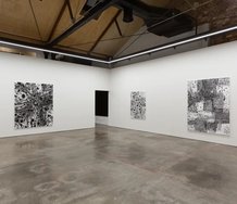
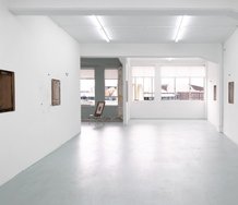
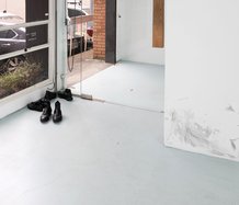
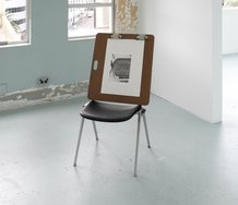
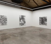
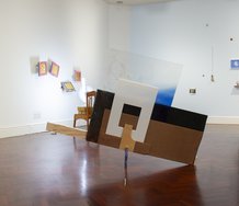
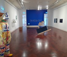
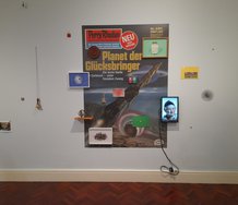
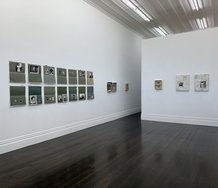
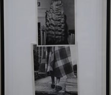
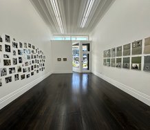
The nine works Judy Darragh presents in this show make excellent use of the generous downstairs Two Rooms space: lots of air around each item and a clever division down the middle that lines up two plinths (each half the stud height) to mimic the two central columns.
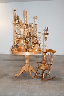
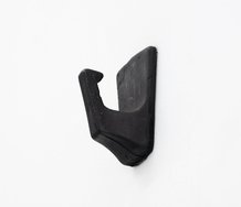
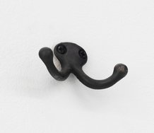
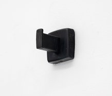
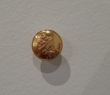
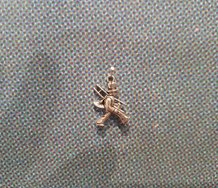
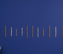
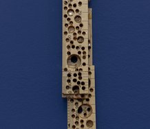
As a colourist Darragh’s chromatic combinations in her wall and floor works often are too brash, especially with her use of fluoro, or with too many hues. She succeeds therefore when the palette is dead simple. So in this show it is the stained wooden pieces with no applied colour that are the more intriguing - lathed column forms mixed with squelchily glued-on animal carvings, corkscrews, candlesticks and furniture. Between the joins the hokey-pokey toffeelike glue oozes down the sides.
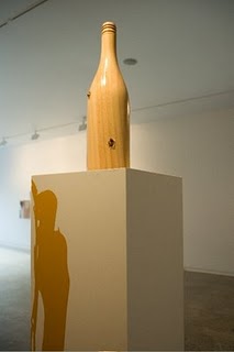
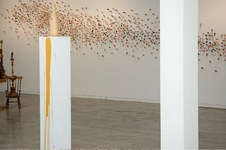
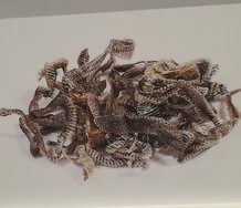
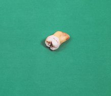
In the middle, two wooden lathed champagne bottles on the white plinths appear pierced by copper bullets. The stands below the ‘wounds’ are splashed with yellow ochre ‘blood’. These trickling marks could also be urine from exuberant hunters. The copious quantities of alcohol they seem to have quaffed could be connected to the hundreds of pinned up, paint-dunked wine corks spread like an angry swam stretched out across the long wall.
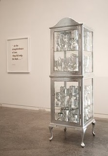
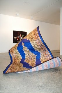
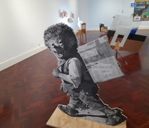
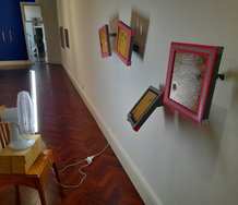
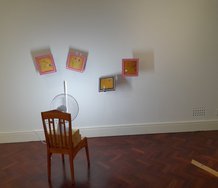
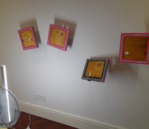
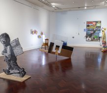
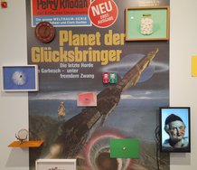
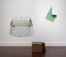
Near the wall by the gallery entrance are two stacked up silver painted cabinets crammed with amusingly tawdry goblets, made from plastic bottles and covered with thin silver tape. Like the corks and wooden bottles these pantomime-like props allude to excessive consumption; they are a comment on waste. Yet they have a pathos, a sense of being tragic as well as didactic and funny. Also amusing is a stiffened, brightly coloured Turkish rug, rearing up high off the floor as if it was a Cobra. For a simple idea this unexpected sculptural form has great impact.
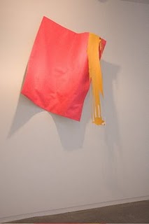
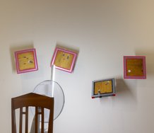
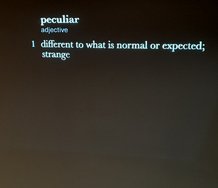
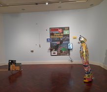
Near the opposite corner of the room is a pink banner projecting out from the wall, hung high and attached to an ochre ‘flowing paint’ cut-out canvas. Like the rearing rug, this is very simple, but the two colours combine well with the oddly shaped hanging and shredded looking ‘brushmarked’ material. So whilst I normally dislike Darragh’s colour combinations, this one turns my knees to jelly. I like the controlled chromatic restraint (contextually the fluoro works), the nutty but mesmerising shapes, their peculiar trickling down associations. It’s a strangely lopsided, badly shredded, candy coloured flag seemingly pulled in two directions by competing vectors of gravity. My favourite.
John Hurrell
 Advertising in this column
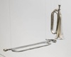 Two Rooms presents a program of residencies and projects
This Discussion has 0 comments.
Comment
Participate
Register to Participate.
Sign in
Sign in to an existing account.