


John Hurrell – 11 May, 2009
Gimblett is best when the compositions are simple with dramatic power. Yet, there are very few of those here. The focused energy has got lost because he has used too many colours and too many layers of overlapping painted marks. Mixing traditional Japanese calligraphy (as he usually does) with an airier version of de Kooning's interwoven but floating, push-and-pulling brush application, doesn't gel. And where he has used a Pollock-style dribbled line (white on black) the linear shapes are too anaemic and flabby, lacking muscle.
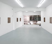
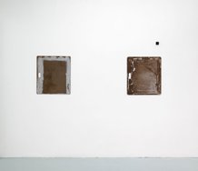
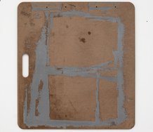
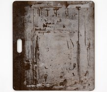
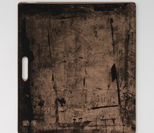
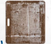
In this presentation of sixteen variously sized paintings we have the two kinds of supports Max Gimblett is now well known for: the quatrefoil and the double or single square - both combined with a Zen ‘no mind’ calligraphy applied onto a usually glossy or gilded surface.
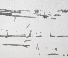
The separation between the first background coat and the spontaneous pictographic mark is now disappearing. The former is becoming thinner, scrubbier and gestural in itself, and the latter, the applied linear strokes, the ‘drawn’ component, have become more fragmented, more scattered, feathered and splasherly. The painted-upon and painted-line-itself have now become confused, if not merged.
Gimblett is best when the compositions are simple with dramatic power. Yet, there are very few of those here. The focused energy has got lost because he has used too many colours and too many layers of overlapping painted marks. Mixing traditional Japanese calligraphy (as he usually does) with an airier version of de Kooning’s interwoven but floating, push-and-pulling brush application, doesn’t gel. And where he has used a Pollock-style dribbled line (white on black) the linear shapes are too anaemic and flabby, lacking muscle.
In this show we can see some unusual combinations being explored. Gimblett’s occasional use of fluoro colours in some quatrefoils is intriguing simply because their high key, garish hue is combined with a traditional Christian motif. Sugar candy chroma pitches here an oral viscerality, enabling a spiritual lollipop to be laid over with sweeping traces of arm movement. Gimblett’s interest in colour has greatly shifted from the late eighties when it was more holistic, harmonious and chordal. He is now rejecting good taste in his embracing of the discordant. Perhaps a good thing.
Full Fathom Five seems to be a holding exhibition, an interim stage where resources are being gathered and assessed in preparation for changes to come.
John Hurrell
 Two Rooms presents a program of residencies and projects
 Advertising in this column

This Discussion has 0 comments.
Comment
Participate
Register to Participate.
Sign in
Sign in to an existing account.