

Peter Ireland – 25 August, 2014
A provincial desire to show off local work in a space designed to impress visitors might easily be a strategy ending in embarrassment. But, from the beginning, the gallery's exhibition programme has been run by the Sarjeant's curators and the shows installed by their exhibition technicians, leading to standards of professionalism rarely seen in operations fundamentally shaped by the needs of tourism's public relations.
Whanganui
Work by graduates of the UCoL/Whanganui School of the Arts and School of Design: Katie Breckon, Dominic Burrell, Martin Poppelwell, Ben Pearce, Karin Strachan and Joseph Salmon
Degrees of Remembrance
Curated by Greg Donson
1 February - 10 August 2014
Sometimes a surprising and utterly engaging show can turn up in an unlikely place; the experience for a reviewer resembling an unexpected glass of champagne at the end of a hot summer’s day. After conscientiously doing the rounds of exhibition spaces summoning the energy and focus to take seriously the products of the degree and dealer gallery promotional industries, the jaded critical writer seizes the glass with both relief and renewed hope.
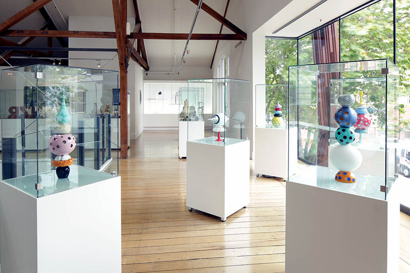
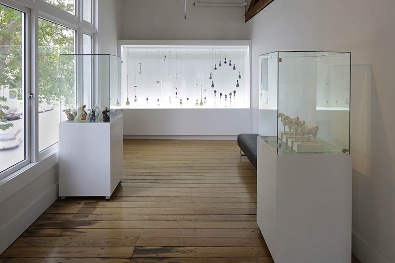
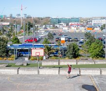
Whanganui’s Quay Gallery’s a bit of an oddity as galleries go. Some years ago, under the Michael Laws mayoral regime, an old building at the edge of the CBD but near the River was expensively refitted as a more adequate, accessible i-site, and on the first floor an exhibition space was created to showcase local art and design. Given the lack of staff to supervise the space and the amount of natural light pouring in the generous windows, the only items to qualify for safe display could be those made of hardy materials such as found in sculpture, glass and jewellery, the objects securely shown in locked vitrines and glassed-in wall displays.
A provincial desire to show off local work in a space designed to impress visitors might easily be a strategy ending in embarrassment: chocolate-box images of the famous Drop Scene on the Whanganui River or the paddle-steamer Waimarie plying the lower waters etc. But, from the beginning, the gallery’s exhibition programme has been run by the Sarjeant’s curators and the shows installed by their exhibition technicians, leading to standards of professionalism rarely seen in operations fundamentally shaped by the needs of tourism’s public relations.
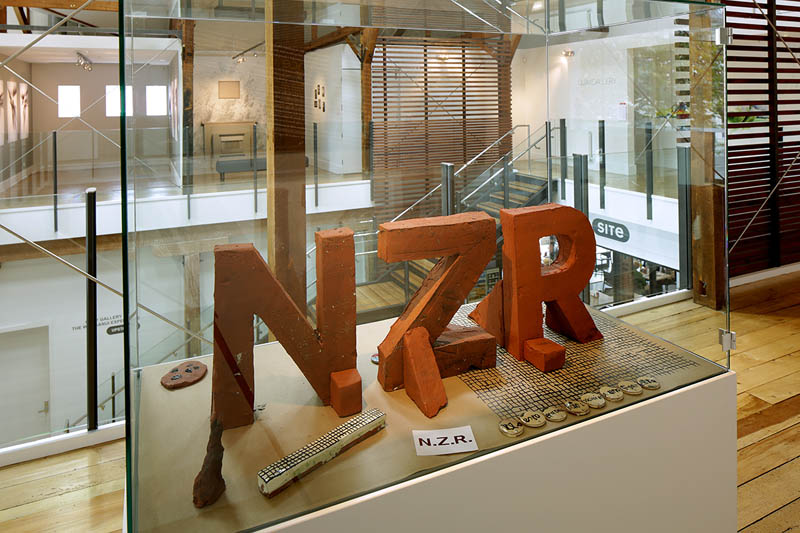
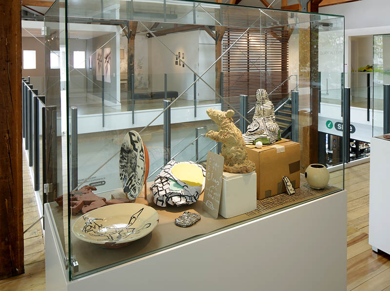
In a developing situation not envisaged when the i-site was planned, this Quay Gallery has become in recent months part of a new cultural precinct on Taupo Quay, with the re-location of the Sarjeant’s public programme - and staff - to another strengthened and refitted old building almost opposite the i-site - while the truly iconic 1919 Sarjeant building is extensively earth-quake strengthened. So, what was a relatively isolated exhibition location is now part of a potentially dynamic matrix of galleries.
For a lot of art-world people, the Whanganui is the Sarjeant - indeed, an image of the building by photographer Leigh Mitchell-Anyon with a snow-clad Ruapehu echoing the shape of the dome in the far distance is central to the District Council’s branding - but in recent years various branches of the former Whanganui Polytechnic have had a certain impact nationally, such as the School of Design (especially when lead by the charismatic and dynamic Hazel Gamec), and the Glass School, now an independent entity. There used to be a ceramics department too, but when Palmerston-based UCoL took over from the Polytech in 2002 ceramics was sent packing - just at the moment it was making a comeback as a contemporary art form, the bigger picture seldom being the province of bean-counters.
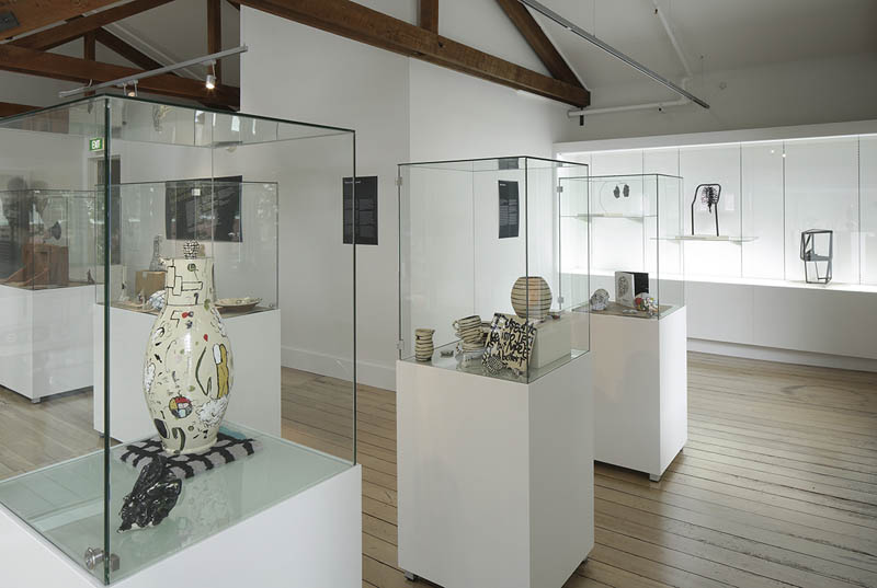
One of the ceramics tutors had been local potter Ross Mitchell-Anyon, who is probably Whanganui’s most widely-known artist nationally: those in the know regularly beat the path to his door from all over. The exhibition Remembrance references all these links and consists of recent work by six artists who graduated from departments of the former Wanganui Regional Polytechnic, now UcoL/Whanganui, and reveals a diversity of practice and approach that seem to encapsulate very contemporary developments in the wider art world.
Of the six artists in Remembrance, the best-known outside Whanganui is likely to be artist Martin Poppelwell, now based in Napier. He may have cut his teeth at the old ceramics department in Whanganui, but later, as Mitchell-Anyon’s informal apprentice for periods of some months, he really found his stride. This connection was commemorated in the former Hawkes Bay Museum’s 2008 memorable, quite seminal exhibition Raising Boys, where Mitchell-Anyon’s mentoring - along with Richard Parker’s - was celebrated in a show of their work alongside that of their “boys”: Paul Maseyk and Andy Kingston as well as Poppelwell.
Poppelwell cultivates a bad-boy, devil-may-care, smart-arse persona, all of which are signature qualities in his ceramic work. Not only does much of his work challenge viewer assumptions about ceramics - cocking a snook at “finish” in the wonky, often broken objects, pretending to be the off-spring of functionality - but assumptions about the nature of art too. The common complaint of “My grandchild could’ve done that” could here be superceded by “My donkey probably did that.” One of Poppelwell’s victims in this show is the reverence accorded McCahon’s work: the ceramicist doing a riff on the Elias series anything but reverent, and while enjoyably taking the piss does usefully skewer some of the pieties this kiwi master’s work is so often bogged down in. Poppelwell’s our Charlie Chaplin of clay.
When a student in his third year at art school, Ben Pearce did small photographic portraits of children’s much-loved animal toys, the dog-eared, one-eyed bears etc all shown within corny, oval-shaped 1970s’ faux leather framing devices, with 60 or so of them mounted on a narrow corridor wall in the end-of-year show. Their affecting pathos and ragged love still ring in the memory a dozen years later. While his work has moved from photographic to sculptural expression, his subject’s still childhood - often the subject for writers, but not so much the concern of visual artists. It’s far from the cuteness of babies in flowerpots though. Pearce explores the darker fears of childhood, stemming from his own when accumulated terrors seem to have induced physical reactions in the form of asthma, eczema and stuttering. Physically this involved breathing difficulties, and socially, isolation; so in his solitude he made objects as a way of making sense of his world, and now in fatherhood this making has taken on a new intensity as a fairly profound meditation on the psychologies of being a child. Among the found materials he often uses there are no flowerpots.
Any new medium in art suffers from the lack of a lexicon with which it can be discussed, through which a tradition of consideration might be established and built on. It’s taken a while for both ceramics and photography, for instance, to find their own feet in this evolving process, one which allows them to be taken seriously as art forms. As yet, glass lacks this. Its often seductive nature - those shiny surfaces that Koons would die for, rich enough colours to turn Matisse an envious green, that quality of light to send Bill Culbert spare - tends to mask this brutal fact. And there’s always a suspicion that because of the medium’s essential intractability it’s the mere technical virtuosity gaining the admiration. Are those shiny surfaces only skin deep?
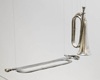
Dominic Burrell’s statement accompanying his five glass works includes this: “What draws me to the design and production of glass forms are the formal qualities of composition. I am drawn to the aesthetic placement of point, line, plane and the use of colour within this.” While this could seem largely process-oriented, the statement might also apply to, say, US painters such as Kenneth Noland and Ellsworth Kelly. On the other hand, the show’s curator ends his statement with this: “Burrell’s works are a timely reminder that often the most engaging works of art are those that are unabashedly grounded in an exploration of their own qualities that celebrate their medium.”
Nevertheless, Burrell’s signature welded-together stacks of individual glass forms are fascinating objects, having a baroque excess as well as a fetish mystery not without menace. We’re assured by the curator that their place in a show about remembrance relates to the artist’s early interest in meteorology and drawing isobar-like forms having a connection with these freshly-made stacks. There may have been some drawing of a long bow too.
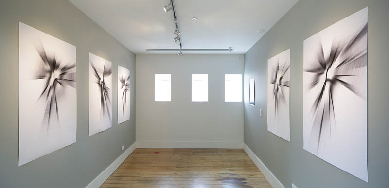
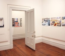
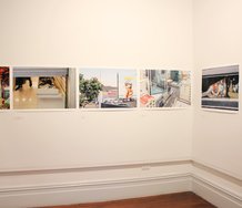
Joseph Salmon is better-known as a graphic designer, but this foray into the nature of perception and his visual mapping of aural experience tells of a sophisticated interest in white noise - what we hear when we’re not listening. If our ears let us down, Salmon’s engaging our eyes to take up the slack. When the show was suggested he went into the gallery, stood quietly in the space, and listened. What he heard was an air-conditioning duct from the i-site’s café below humming quietly inside the wall. Through a computer programme he developed, recordings of these sounds were processed into still images, and five of the variations appear on the gallery walls, and you’re meant to look at them standing on the spot - marked by a large red dot - where the artist first “heard” them. The images resemble charcoal interpretations of auroras. Remembering is a far from exact science, and this intriguing project replicates what might happen when then becomes now and encourages a degree of scepticism about the nature of memory.
The nature of memory is also Katie Breckon’s subject. She recreates the living room of the house she grew up in and which her family retained into her adulthood. This Thomas Demand-like construction of mostly cardboard and drawn-on paper is complemented by a series of photographs on one of the walls, Like a Thief in the Night, images of aspects of a cardboard model of the whole house based on the original floor-plan. This largely colourless recreation suggests the anonymity of a tabula rasa, seemingly at odds with the notion of a rich memory, yet illustrative of the common but resisted reality that much of memory is made up, albeit unintentionally.Memory as a phenomenon is an unreliable guide as to what might’ve happened. But it’s a very reliable guide vis a vis the construction of a self.
In a century of Modernism it was never fashionable to factor in the spiritual - unless it was of a vaguely Eastern kind and you happened to be an Abstract Expressionist. This re-tooling of the Sublime still has some kind of life in the work of, say, Max Gimblett. A continuing suspicion of its distant cousin, organised religion, has kept the spiritual hovering at the margins, the province of those who believe in crystals and Druidical dances at the solstice. But for Karin Strachan in Remembrance it has a centrality to her practice. There’s nothing airy-fairy in the objects she makes, though: they’re solid, historically grounded and unforgettable.
For her, Enlightenment is not a description of an 18th century philosophical phenomenon, but a reference to a completion of human consciousness as understood by followers of the Buddha. In her sculptural piece Under the Rose she takes the light of enlightenment literally, employing a series of cast glass light-bulbs hung from their leads at varying heights to create an austere rose garden, which is not at all literal but elusively metaphoric, poetically linking the word rose as a verb to the whole garden idea as a blossoming, and linking that to the higher state of Buddhist enlightenment. The bulbs (a further metaphor of growth) are not sparkling specimens off a supermarket shelf. They’re encrusted, like the exhumations of an archeological dig, suggesting an age-old process, and, perhaps, a contest between the physicality of earthly materials and the other-worldliness of light.
Art history has its rituals in the constant re-examination of certain themes and symbols: there’s nothing discordant, for instance, in a comparison between Stachan’s Under the Rose and Bill Culbert’s long-running project. Culbert isn’t known for depicting rabbits though, but in this country the likes of Peryer, Kregar and Michael Parekowhai are. The rabbit was a medieval symbol of fecundity, but more recently has become what’s known as a virtual totem, the symbol of a complex ontological discussion perhaps best exemplified by Wittgenstein’s use of Joseph Jastrow’s duck-rabbit conundrum.
Stachan’s work, Heroes, consists of 15 cast glass rabbits in a tight formation under a Perspex box atop a plinth. Each commemorates an artist, composer or writer. The label lists the names, but there’s nothing in the work itself to indicate which is which. Perhaps with a nod to privileging instinctive knowledge over the more accepted rational kind Strachan has based her choices on those artists who, in their attempt to extend the boundaries, have been deemed “mad”. It takes history to re-define that as “inspired” - another kind of enlightenment.
Art history’s ritual re-examinations settle on another animal, the horse. Strachan’s Four Horsemen continues a tradition reaching back to the Four Horsemen of the Apocalypse from that strange concluding Biblical account known as the Book of Revelations or the Revelation of St John the Divine, a tradition including Durer’s famous print of the subject. Although it’s possible the four horses of Venice’s St Mark’s may predate the writing of Revelations, it’s highly likely their placement on the venerable basilica’s facade was to remind the faithful of “the pale horse whose name was Death.”
The makers of White Horse whiskey once provided hotel bars with foot-high plaster images of such a pale horse, not so much to frighten patrons’ souls as to loosen their pockets. Strachan has used one of these objects to cast four mostly identical versions, which are displayed side by side, like the Venetian horses, in a case similar to the rabbits’. Echoing the distressed state of her light bulbs, there are bits of the plaster missing, revealing the shiny copper wire holding the objects together, but also revealing in the lack the mortal vulnerability of these magnificent animals.
Three months ago at New York’s Richardson Gallery the artist David Maisel exhibited a suite of photographs replicating X-rays made of antique statuary in Getty archives. The New Yorker described the work thus: “Isolated against pitch-black backgrounds, Buddha heads, a horse, a young warrior, and several classical maidens appear at once hollowed out and full of small surprises. Studs, nails, and other bits of metal support are bright accents in alternately opaque and transparent layers of stone or clay. Squiggles of wire wind around the spine of one female figure, suggesting coils of DNA. With all their inner workings revealed, the sculptures appear touchingly vulnerable - more fragile and, thus, more lifelike.”
Peter Ireland
 Two Rooms presents a program of residencies and projects
 Advertising in this column
This Discussion has 0 comments.
Comment
Participate
Register to Participate.
Sign in
Sign in to an existing account.