

Andrew Paul Wood – 5 April, 2014
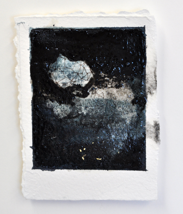
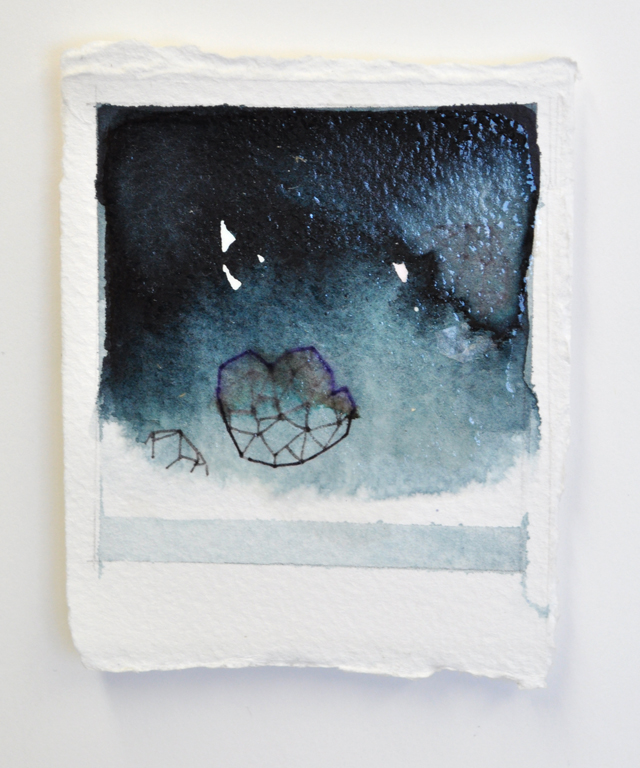
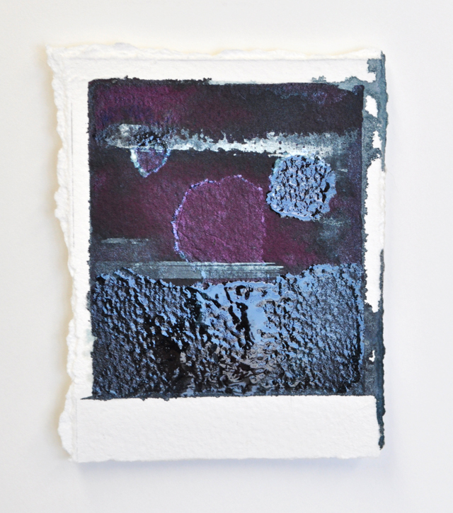
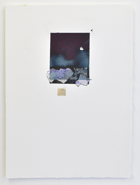
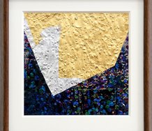
Julia Croucher's postcard-sized miniatures seem to seek out a more abstract expression than previous, more obvious landscapes. There is a great subtlety that pulls you in close to look at the details. The ambiguous divisions of surface and horizon suggest Rothko, but rendered in a brooding monochrome of ink and varnish more suggestive of later McCahon.
Following the Christchurch quakes, the dynamic of the city’s exhibition calendar changed dramatically. New spaces like Chambers 241 appeared, or like ABC Gallery, appeared and disappeared. Some overlooked venues which had been showing quality work all along came to greater prominence, and so it was with the gallery space associated with David Trerise’s City Art specialist framing workshop. It goes a long way to show that commercial interests and the arts can go hand in hand without difficulty if handled sensitively.
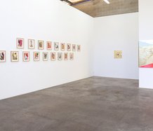
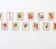
Graduates of the University of Canterbury School of Fine Arts had it particularly tough, especially since the loss of SOFA Gallery in the Arts Centre and the tight programme of Canterbury’s campus gallery, so it is marvellous that we can see the work of three young Canterbury graduates shown together like this - and of course your reviewer is noted for his fondness for painting. The title of the show, <3, is of course the heart emoticon - the show is about love.
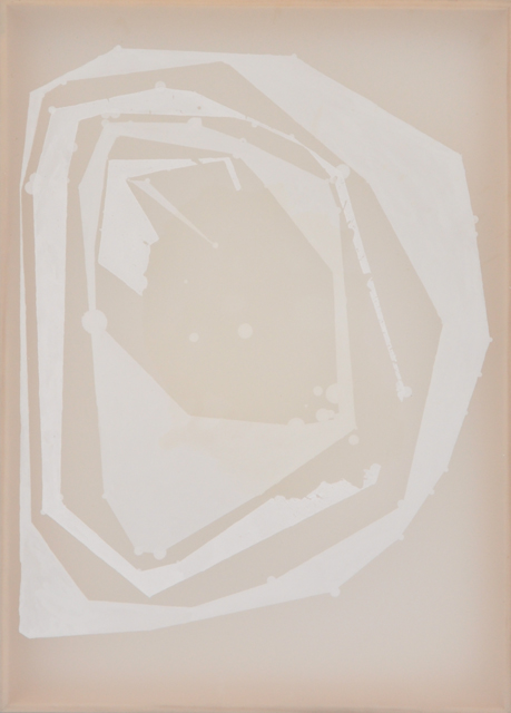
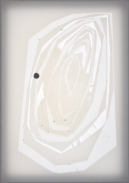
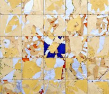
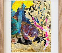
Ana Iti’s paintings are highly enjoyable. Under the lights some reflective quality of the gouache gives them a soft luminosity that seems to come from within. There is a delicate play between flat surface and illusory depth. In style they have a retro-futurist quality that rests somewhere between roses after the fashion of 1950s Googie or Populuxe design (certainly they would be comfortable enough on the walls of a chic apartment in The Jetsons) and galaxies filtered through biomorphic abstraction. The Science Fiction element seems supported by the titles; Phobos, and Deimos I and II - named for the two moons of Mars. Curiously the titles can be read as the antithesis of the love theme - literally “Fear” and “Terror” - the two horses pulling the War God’s chariot.
Julia Croucher’s postcard-sized miniatures seem to seek out a more abstract expression than previous, more obvious landscapes. There is a great subtlety that pulls you in close to look at the details. The ambiguous divisions of surface and horizon suggest Rothko, but rendered in a brooding monochrome of ink and varnish more suggestive of later McCahon. This is counterpointed by slightly water-blurred crystalline and geometric, border breaking forms drawn in what appears to be a fine fibre-tipped pen. The blurring brings out the reds and mauves used to make the pen’s commercial black ink.
The abstract horizon recalls the Sublime, and the geometric forms suggest the crystalline forms of Bruno Taut’s fantasy pavilions and the dramatic landscapes of Caspar David Friedrich (perhaps if he had seen the movie Tron), putting them firmly in the Romantic tradition for all their abstraction and gesture.
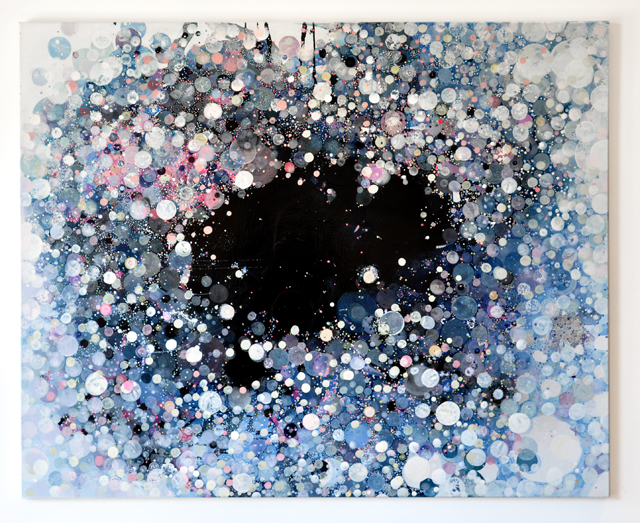
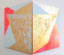
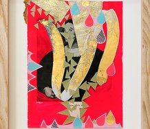
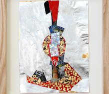
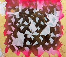
Ed Lust has only one painting in the exhibition, but it dominates the wall. The title, Agape, unconditional and often divine love, hints at its ambiguous and abstract nature. It is impossible to judge the quality of ideas based on a single work, but the complex and kaleidoscopic centrifugal layering of flat pastel discs and dots have a cumulative effect to those baroque trompe l’oeil ceilings that give the impression of an impossibly high architectural dome dissolving into the infinite vault of heaven. In Agape, however the flamboyant congeries of discs give way from washed out impressionism (like looking up into the sunlight through cherry blossom in a faded Manga strip) to a black abyss between the galaxies.
It’s a tight little show and easy on the eye.
Andrew Paul Wood
 Advertising in this column
 Two Rooms presents a program of residencies and projects

This Discussion has 0 comments.
Comment
Participate
Register to Participate.
Sign in
Sign in to an existing account.