John Hurrell – 23 August, 2011
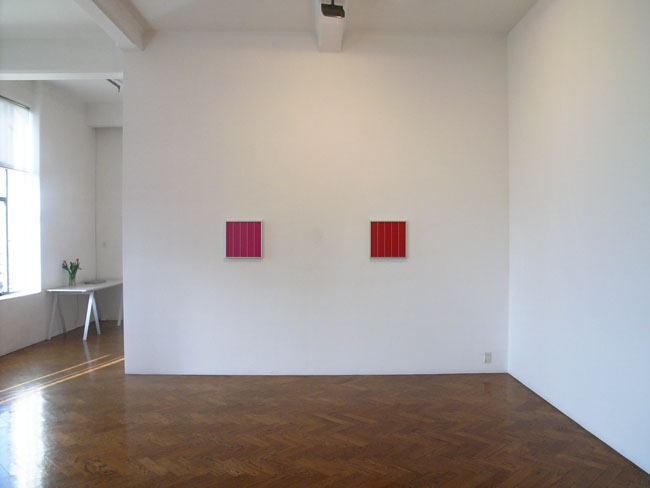
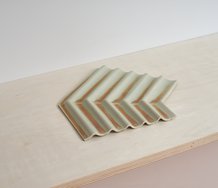
The smaller works are subtly different from the large ones in composition. The upper and lower ends of the vertical lines are not equidistant from bottom and top. The bottom tips (when looked at from a distance) are just hidden by the frames. The top tips have a gap and are not hidden. They finish clearly below the protruding lip of the framing.
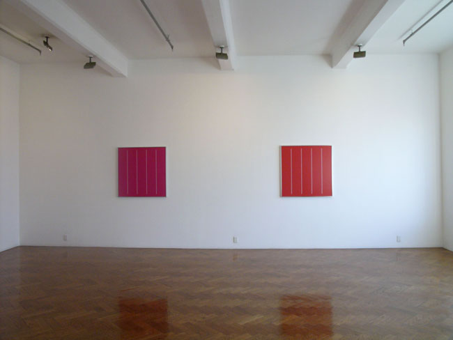
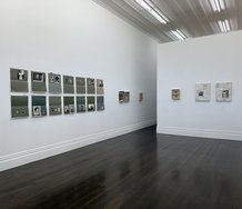
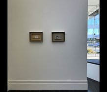
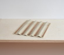
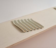
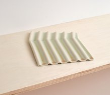
At first glance they seem to be paintings, these four digitally manipulated colour photographs presented here by Ava Seymour - each one framed and under glass. Two colours are used: a hot red (a crimson) and a cold one (magenta). One is slightly orange, the other slightly blue. And there are two sizes of square: with sides of 100 mm and 40 mm.
These works are initially baffling because they are pretty severe geometric forms. I think Seymour is interested in how we look at flat objects, like paintings. These are photographs made to look like paintings. Not abstract paintings, for ‘abstract’ is too vague. Rather these function differently from a colour field that somebody like Newman might think about; they are more about perception and have affinities with the very early work of Robert Irwin the Californian artist. For example, have a look at this discussion of the importance to Irwin of making fine adjustments, and think about Seymour’s exhibition title.
When you are standing in Crockford’s space and peering at the two pairs of square image there are two aspects that become apparent. Firstly the colour is about advancing or receding blocks of chroma. Because of the different combinations of the three types of conical photoreceptors in our retina, red colour on a white wall will advance towards us and blue will move away. So the crimson hovers closer to us than the magenta. With the two sizes, then we compare perspectival distance too. Does say the small crimson loom closer than the large magenta? They are on opposite walls so we have to turn our bodies around and compare using memory.
Now the other property they have is that of vertical white parallel lines - widely separated pinstripes, four of them, dividing the square into five strips. The large squares have the lines in the middle of the square. They cease about 2 inches from both the top and lower aluminium frames, the same distance from each metallic edge.
The smaller works on the other hand are different. The upper and lower ends of the vertical lines are not equidistant from bottom and top. The bottom tips (when looked at from a distance) are just hidden by the frames. The top tips have a gap and are not hidden. They finish clearly below the protruding lip of the framing.
Now there is a standard procedure that when paper artworks are mounted behind cardboard so as to peep through a cut out window, there is more space below the aperture than above. A standing figure looking at the rectangle on a wall will get more foreshortened distortion nearer the bottom than the top, so to compensate, more space is provided below than above. The two heights are deliberately different so that the top doesn’t veer towards the viewer but swing away.
So (to speculate) with Seymour’s smaller photographs, instead of perpendicular planes hovering in space as with the large works - with a slight upper lean towards the viewer because of no compensatory distortion at the base - we have the linear elements again causing a barely detectable tilt forwards, but this time due to ‘added’ surface area at the top.
So within Seymour’s exhibition two sorts of (almost undetectable) linear-generated tilting interlock with two slightly different varieties of (obviously apparent) hovering coloured plane. The show is about looking closely at what’s on the walls as coloured forms - and considering the brain’s impact on our understanding of space, as our bodies prepare to move through it.
John Hurrell
 Advertising in this column
 Two Rooms presents a program of residencies and projects
This Discussion has 0 comments.
Comment
Participate
Register to Participate.
Sign in
Sign in to an existing account.