


John Hurrell – 14 February, 2020
In this show Dahlhausen's title puts forward the notion of colour and paint being one, but as you'd expect, the role of physical support or substratum is crucial too. The constant variable here is applied paint: there is no printed colour or embedded colour—it is layered. It comes from poured, brushed, sprayed or rollered on pigment—placed on a nonporous or absorbent surface. Sometimes temporarily.
Auckland
Helen Calder, Renee Cosgrave, Christoph Dahlhausen, Judy Darragh, Katharina Grosse, Marcia Hafif, Callum Innes, Noel Ivanoff, Leigh Martin, Simon Morris, Christine Reifenberger, Winston Roeth, David Thomas
WestFabre: Paint vs. Colour
Curated by Christoph Dahlhausen
31 January - 29 February 2020
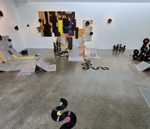
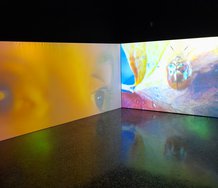
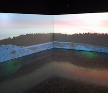
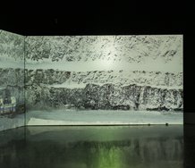
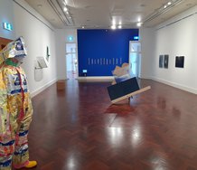
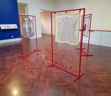
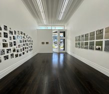
WestFabre is a group show of ‘abstract’ works (the fourth iteration) that started in Germany and which is now touring Aotearoa, incorporating the products of New Zealand artists, mixing them with those from Europe or elsewhere. The title by curator Christoph Dahlhausen links the German word (fabre) for paint and colour with the Western European tradition (from the seventies on) where process replaced finished result, where the materiality of applied substances (traces of procedure) replaced preplanned analysis. Time has greater emphasis: elevated over product.
The interest in process can probably be traced back to works like Lawrence Weiner’s Gloss white lacquer, sprayed for 2 minutes at 40 lb pressure directly on the floor (1968), and Weiner’s balancing of articulated instructions and the resulting gallery exhibit as both being artworks can in turn be directed back to Fluxus in the late 50s with its interest in detailed procedure and written language.
In this show Dahlhausen’s title puts forward the notion of colour and paint being one, but as you’d expect, the role of physical support or substratum is crucial too. The constant variable here is applied paint: there is no printed colour or embedded colour—it is layered. It comes from poured, brushed, sprayed or rollered on pigment—placed on a nonporous or absorbent surface. Sometimes temporarily.
Also, the sharp distinction mentioned above—between the two approaches of using paint—is not as apparent as you might expect. Both sorts are present, dancing around each other, sliding back and forth: overlapping.
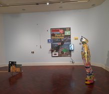
Here are five pairs of works I found stimulating as contrasts in procedure, substratum, and end result.
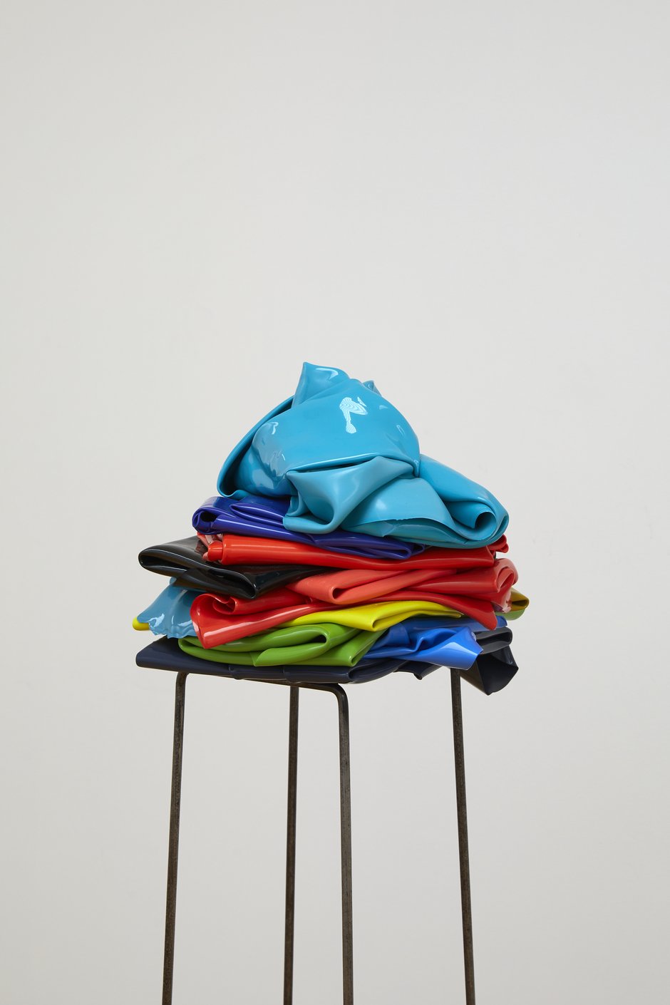
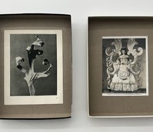
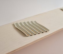
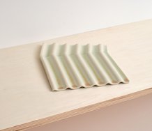
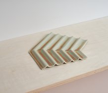
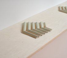
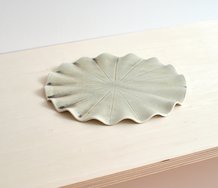
Callum Innes‘ Untitled (2008), made with pigmented resin on canvas, has a lot in common with Helen Calder‘s Polychrome (2016), a work made by placing folded up, peeled off sheets of acrylic paint onto a steel stool. Both involve a disembodied, separation process for dried paint as substance.
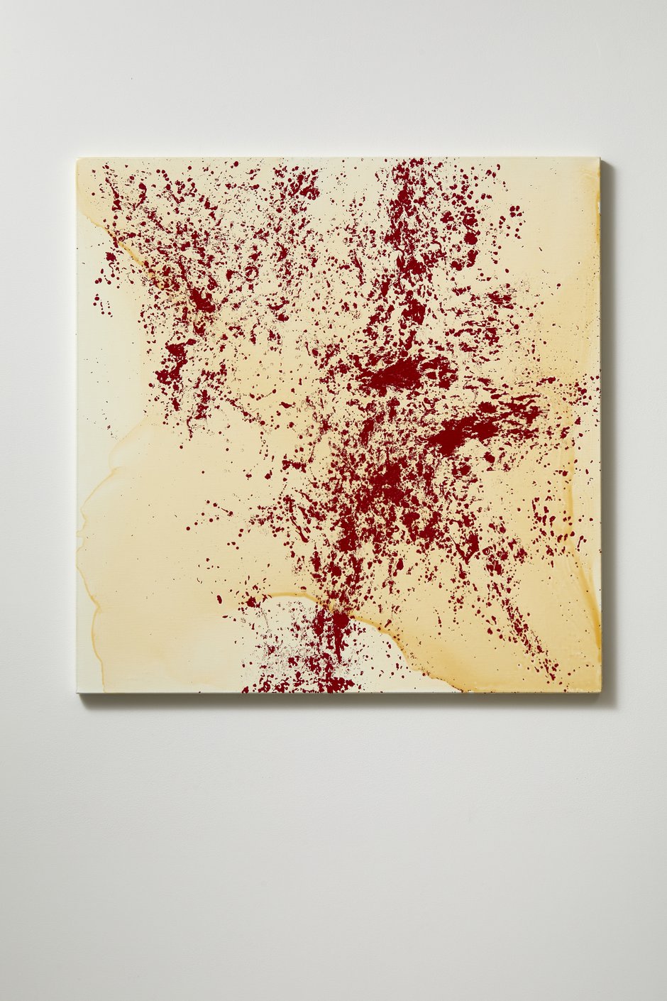
In Untitled Innes uses a brush to flick specks and globules of thick red oil paint onto a canvas covered with wet shellac, and continually picking out and resetting bits of crumbling half dry paint by hand until the shellac hardens. Innes’ myriad splinterlike fragments are deceptive. They look like traces remaining from the application of a solvent as found in his usual (well-known) subtractive practice, but the islands of paint remnants here are much thicker and are in fact additive. Many of the delicate traces come from slivers of oil skin that have been repositioned.
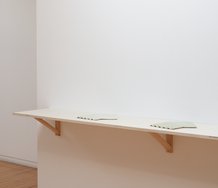
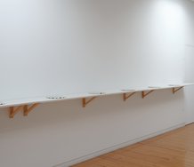
Calder uses a relocation process too, one much more obvious. Resene carefully poured onto a plastic sheet on the floor is left to dry and then peeled off, its ragged edges left or tidily trimmed. Paint is used to make sculpture. It is treated like towels, pillowcases or sheets, and stacked accordingly-glossy rubbery ‘laundry’ that is held up on spindly legs away from the floor.
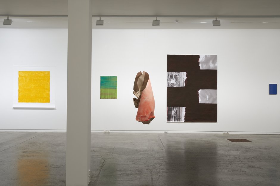
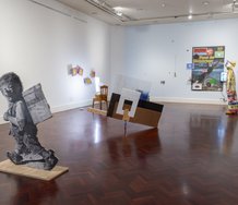
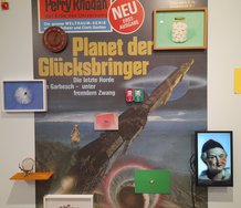
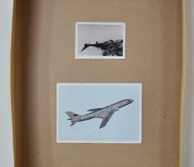
Australian David Thomas (like Dahlhausen) has four contributions. His From the Impermanences Series “The Movement of Colour / Dark Red” (2008), acrylic partially applied onto a large digital photo, has a sliding horizontal movement, chunky blurred-edged rectangles that expose tipped over b/w houses and factories on the left, and wispy cloudy skies on the right. Two universes clash along stacked parallel faultlines. The thickness of the painted-on photograph is seen as inconsequential.
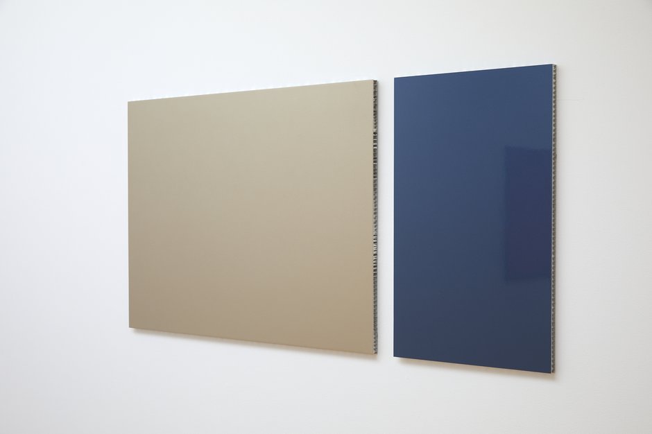
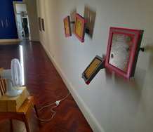
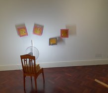
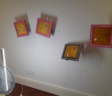
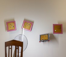
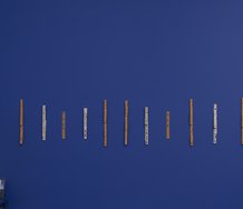
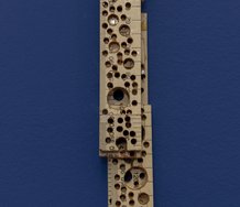
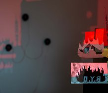
Christoph Dahlhausen’s Bodies (2015) is in two parts: sprayed glossy car paint on a pair of thick aluminium honeycomb panels. Unlike with Thomas’s work the viewer doesn’t just hover directly in front, but peeks into the panel sides, pondering the clusters of short aluminium tubes that hold the sheets of Dahlhausen’s support together. Peering inside is like examining vertical crevasses in a rockface; mesmerising in its own right.
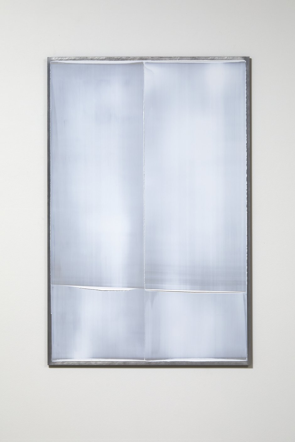
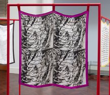
Katharina Grosse and Renee Cosgrave look at brushed-on parallel linear vectors and directional manipulation, one with thin transparent acrylic paint and a restricted palette, the other with thick opaque oil paint and many many hues.
These works are very different. Grosse’s Untitled (2001), acrylic on a thin aluminium panel, investigates horizontal and vertical movement together in two halves, while Cosgrave‘s Lines (2017), oil on linen, causes rough-edged and saturated linear clusters to plummet vertically in a unified fashion.
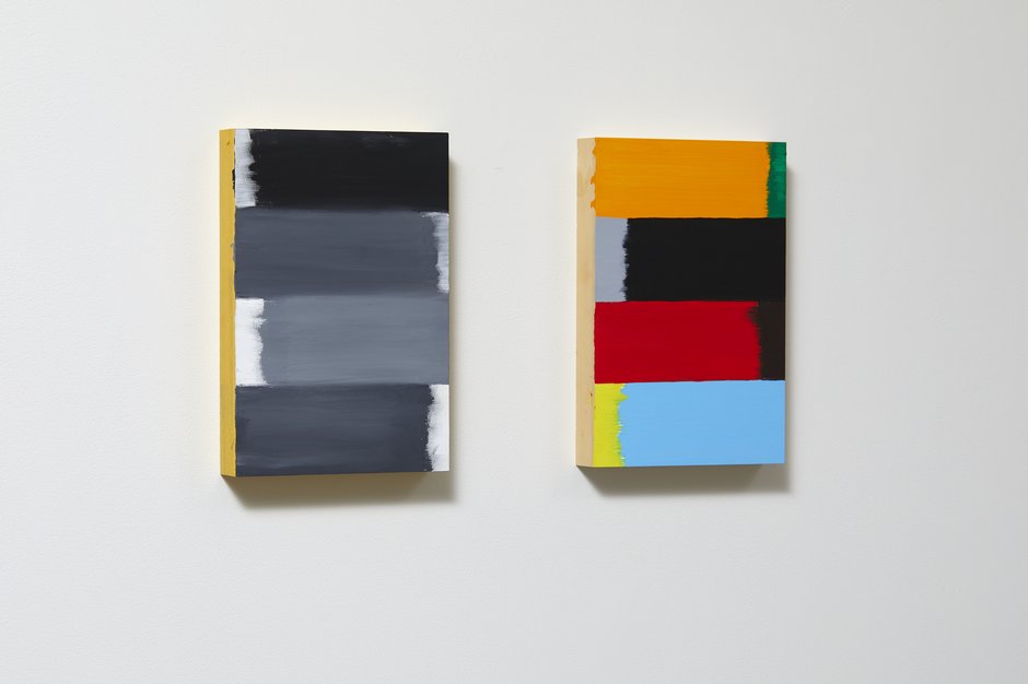
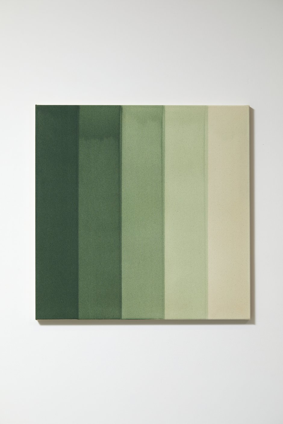
Some processual works have contrasting tactilities. Noel Ivanoff’s Slider White - Prototype (2014), viscous oil paint on an aluminium panel, shows off Invanoff‘s sensitive manual application of creamy snowwhite paint with vertical sweeps of a rubber squeegee. Simon Morris‘ Green Water Colour (2014), thin acrylic brushed onto canvas, on the other hand, reveals granular textures and procedures that accentuate controlled vertical layering over a longer period of time-a sequence of consecutive days.
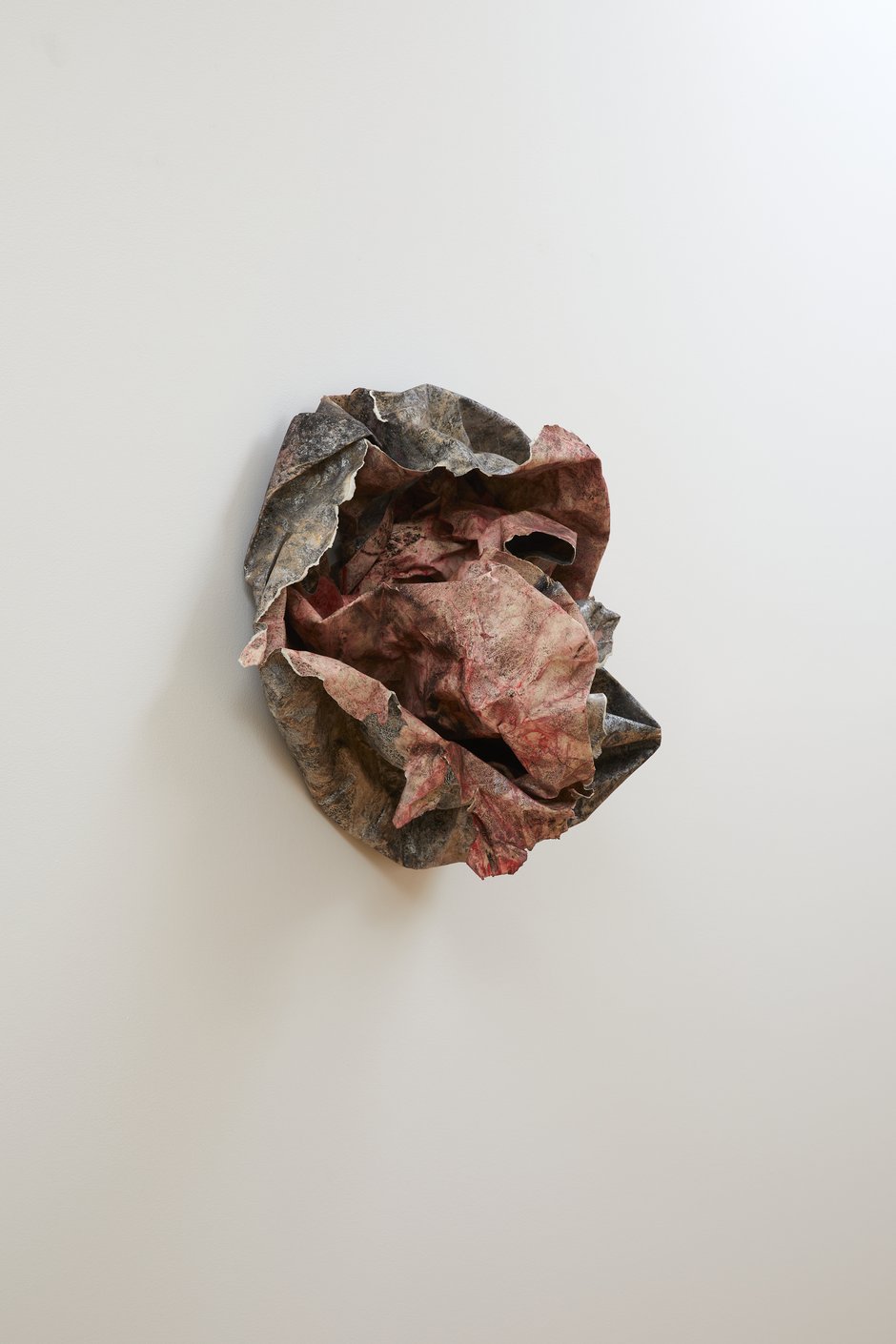
Christine Reifenberger‘s Fleur de Mal (2019), egg tempera on paper, is a sculpture of crumpled and creased paper projecting out from the wall. Reifenberger is expert at creating complex and delicate residual traces from egg tempera, letting it partially dry on the heavy paper, removing the excess liquid and continually repeating the wash/staining/ subtraction/drying process—building up the cumulative layers.
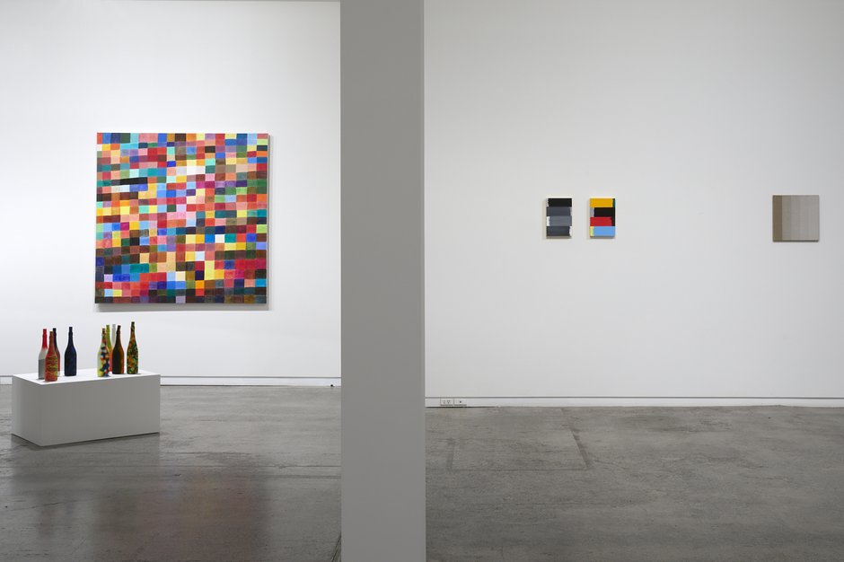
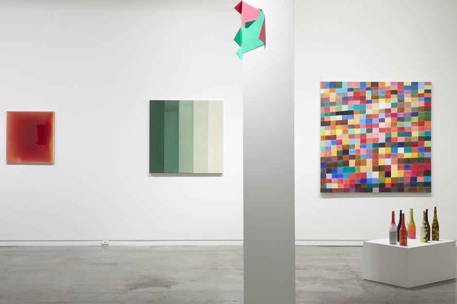
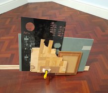
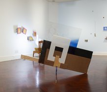
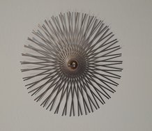
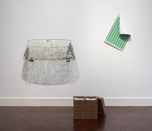
In contrast, Judy Darragh‘s pristine Crease (2020) avoids being ‘expressive.’ It is an elegantly folded sheet-steel sculpture partially wrapped around the upper reaches of a gallery column. Light in weight, and carefully shaped, and held in position by a single brad, it is full of surprises. Painted in vibrating cold green and hot red, the unmodulated complementary hues—together with the visually unstable and lopsided form—seem to twist the vertical support, threatening to unscrew the ceiling and collapse the roof.
Possibly inspired by Chris Burden’s Samson (1985) attempt to destroy the given architecture of a gallery, this angular ‘futurist propellor’ brings a lovely self-destructive and perverse wit to the show. Sizzling colour is more than a dual purpose, ambiguous word. It leads to flat paint leading to physical support leading to social institution. A fascinating sculpture.
John Hurrell
 Advertising in this column
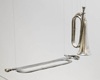 Two Rooms presents a program of residencies and projects
This Discussion has 0 comments.
Comment
Participate
Register to Participate.
Sign in
Sign in to an existing account.