


John Hurrell – 7 May, 2018
With both types of painting (they feature the same colours), the viewer's proximity is an essential factor. Far more important I think than their gazing on a distant vista, even though the colour there is more saturated. Nearness provides pleasure in examining surface or pigment modulation, and delight in the contingent behaviours of the liquid medium. Light within thin paint on a pale support is a crucial element, but so is structure and evocative, underlying, patterned texture.
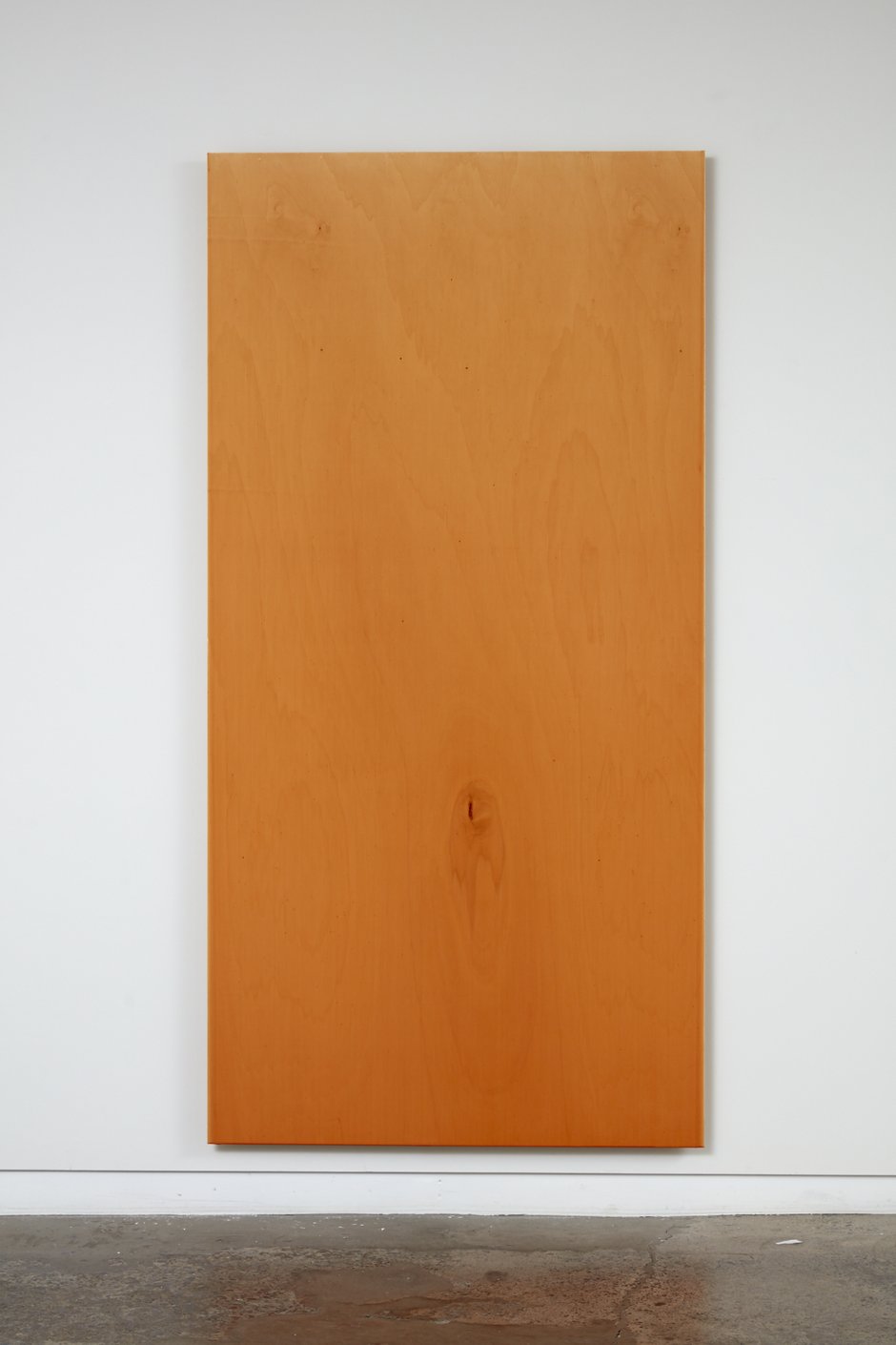
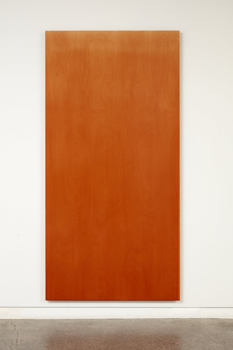
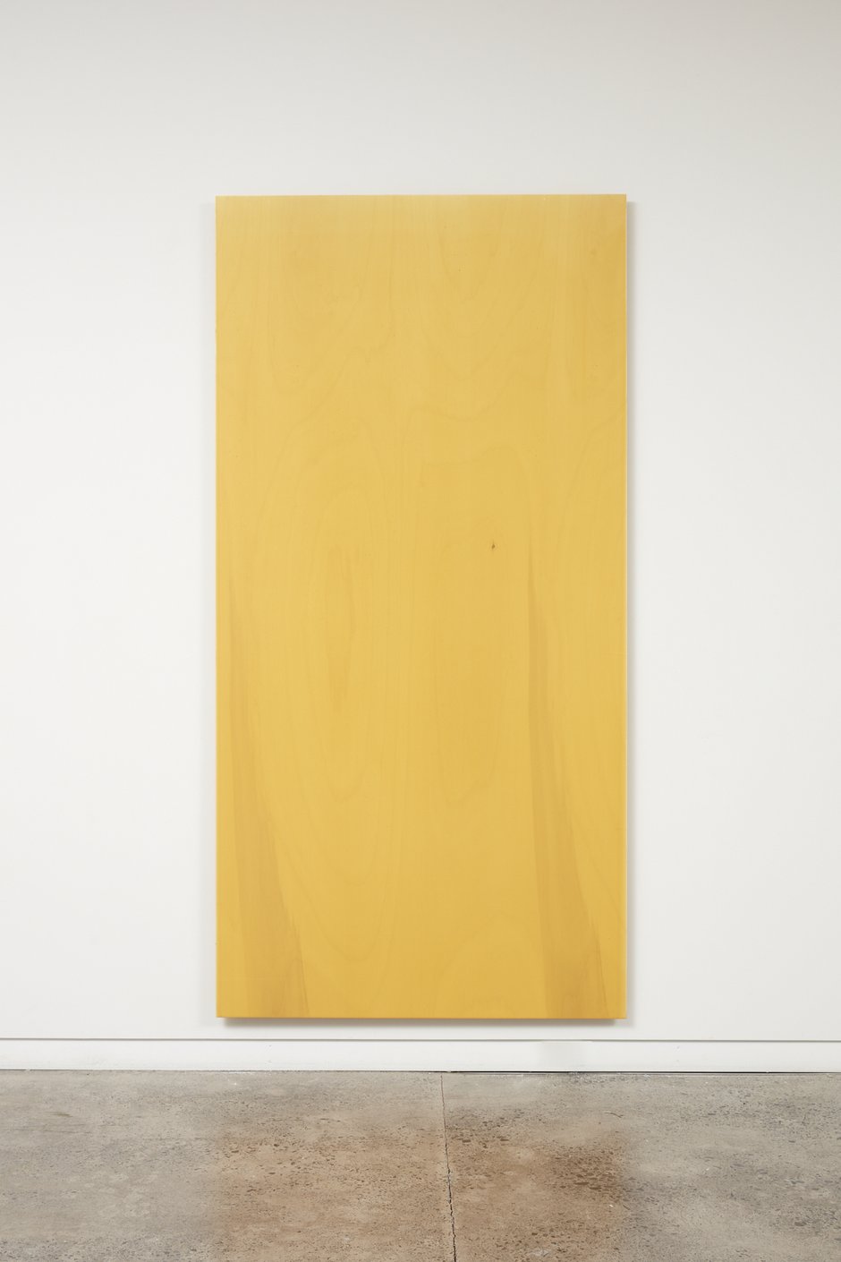
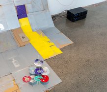
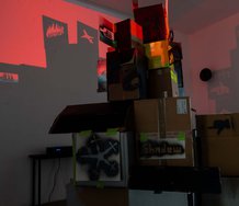
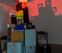
Resulting from experiments he carried out while having a residency in the Headlands Centre in San Francisco, these new poured paintings — besides referencing the wonderful installation he made a couple of years ago in Chrisstchurch Art Gallery—vaguely allude to the techniques of Dale Frank or Larry Poons, with the pouring technique of making a horizontal wooden support (bearing applied runny viscous paint) suddenly vertical and left that way to dry.
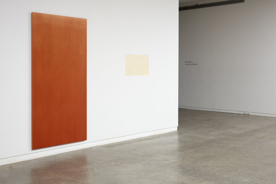
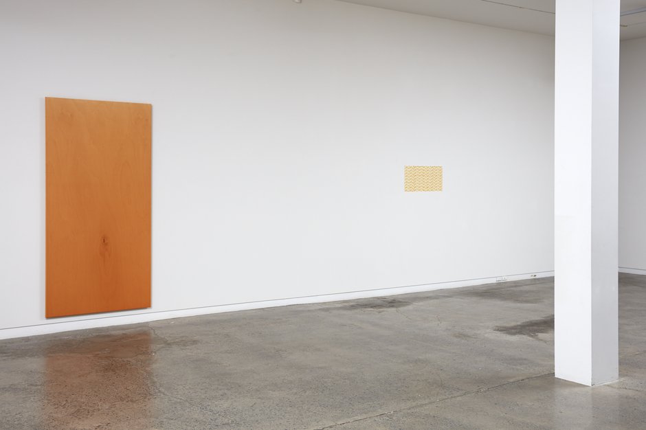
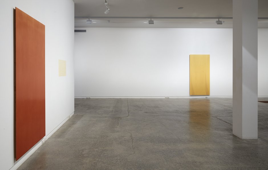
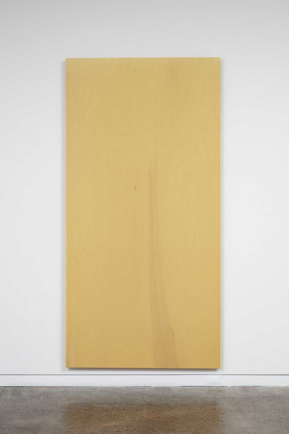
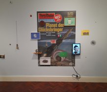
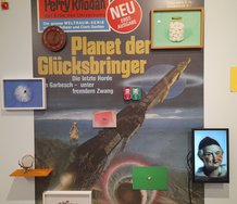
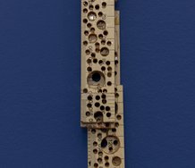
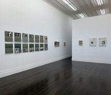
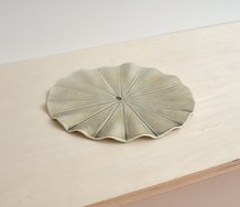
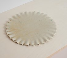
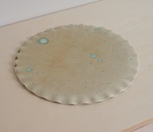
Here he uses transparent glossy glazes of yellows, reds, browns, and oranges to showcase the underlying woodgrain patterns of the Scandinavian plywood made from Baltic Birch or Popular. He cleverly uses the given whorls, ripples, zigzags and knotholes as found drawings, presented via large vertical panels of diluted glossy colour, hung low to suggest standing human figures. You have to stand close to enjoy the woody supports. Morris is of Norwegian descent, so they become a kind of comparatively quickly made, self portrait.
Morris’s use of warm thin colours references summer sunlight pouring down through the treetops of San Francisco forests. Yet for me, as so much of his practice has been about pigment intensity and light anyway, the support here is of special interest. The centrally located knotholes, dark little islands, become dramatic features that seem coincidentally to be like body parts like mouths or other orifices. There is a subtle surreal component that one rarely sees in Morris, that perhaps leads to sexual interpretations, and not light (or paint application process) at all. It is wonderfully ambiguous work.
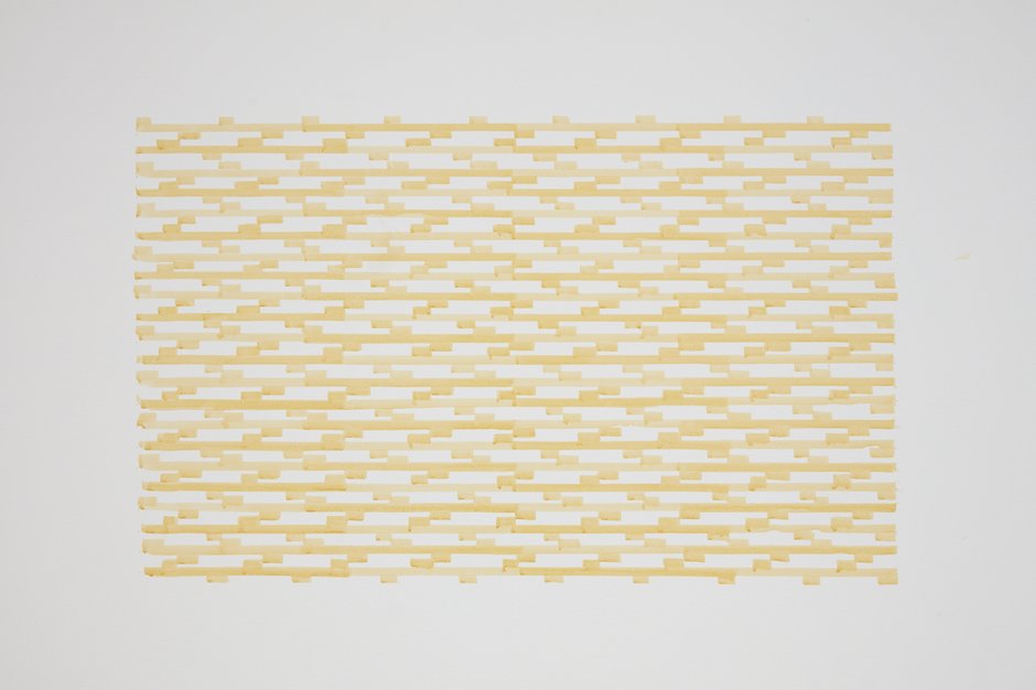
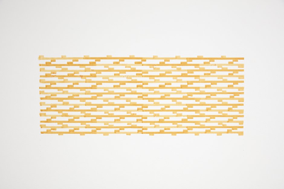
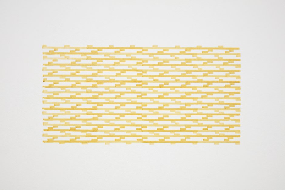
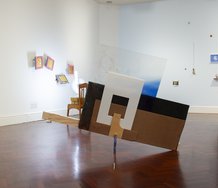
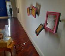
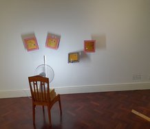
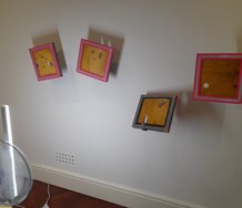
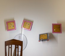
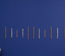
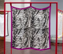
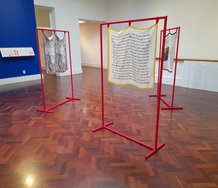
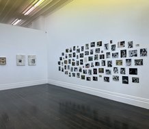
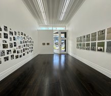
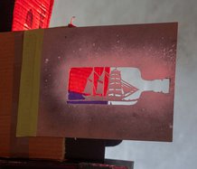
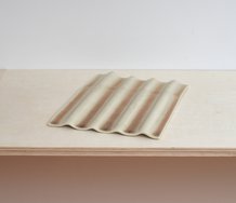
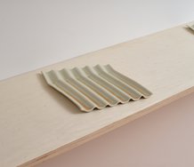
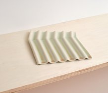
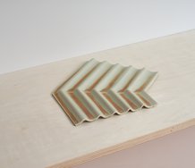
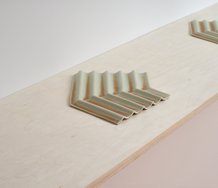
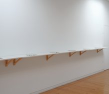
The other elements in Morris‘ exhibition are his much smaller, delicate, wall paintings—complex horizontal grid patterns that seem to have been made with stencils. They are not pristine, the paint drips and oozes, giving them a touch of the unexpected—but are only detectable when you get up near. Possessing an intricate architectural quality, they are suggestive of the struts supporting plane wings, or stacked wafers with reinforcing beams, presenting modulated bars and different heights. With the supporting white wall peeping through between tiny attached rectangles they are quite gorgeous.
With both types of painting (they feature the same colours), the viewer’s proximity is an essential factor. Far more important I think than their gazing on a distant vista, even though the colour there is more saturated. Nearness provides pleasure in examining surface or pigment modulation, and delight in the contingent behaviours of the liquid medium. Light within thin paint on a pale support is a crucial element, but so is structure and evocative, underlying, patterned texture.
John Hurrell
 Two Rooms presents a program of residencies and projects
 Advertising in this column
This Discussion has 0 comments.
Comment
Participate
Register to Participate.
Sign in
Sign in to an existing account.