
John Hurrell – 17 February, 2017
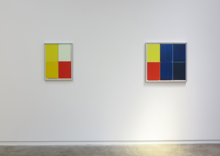
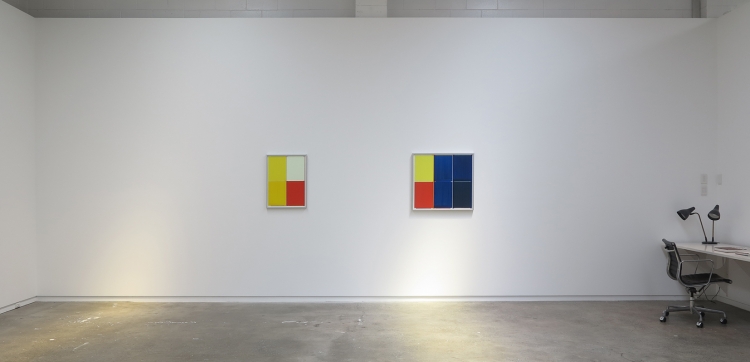
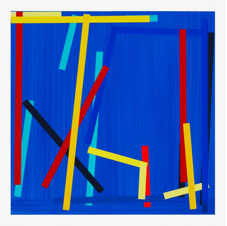
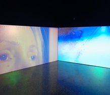
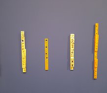
'Before the Storm' and 'Hello Darkness' are simpler than 'Revolver Rot Gelb Blau', having fewer modules. They also have plainer flat fields (in their centres) that act as effective foils for the framing shards of piecemeal colour that border them. Central stability is presented against peripheral agitation; expansive air and light against density and compression.
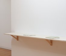
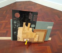
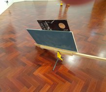
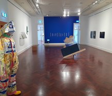
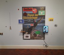
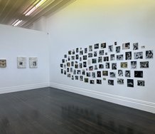
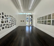
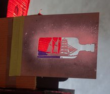
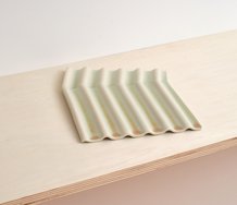
With this exhibition at Fox Jensen, the legendary painter from Dusseldorf is having his second presentation of paperworks in Auckland (the first was in February 2014), the paintings again being under glass and incorporating strips of paper with thinly applied acrylic (almost always primary hues) brushed along or across.
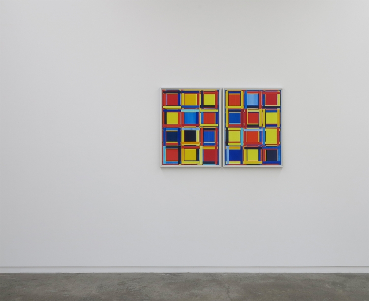
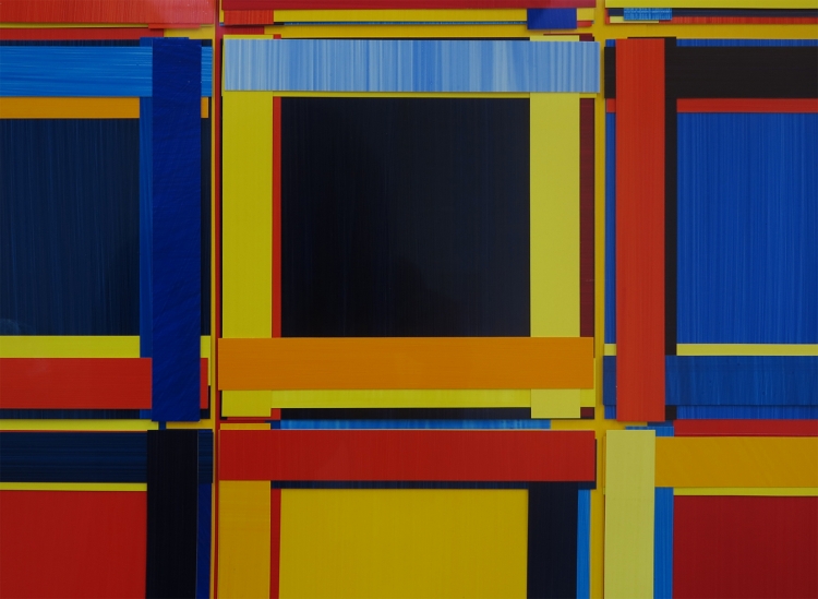
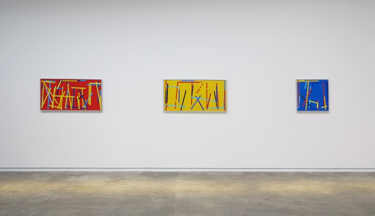
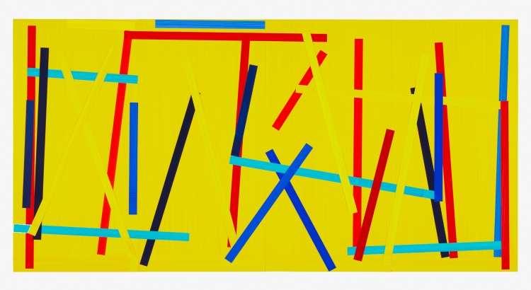
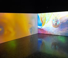
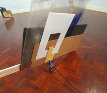
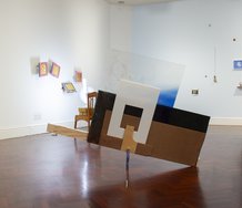
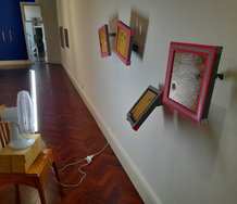
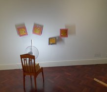
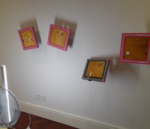
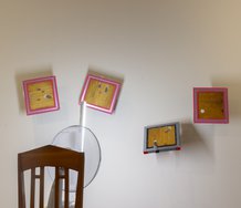
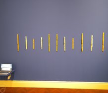
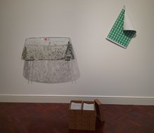
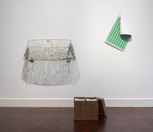
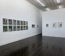
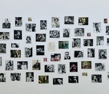
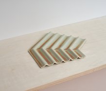
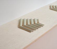
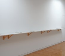
Imi Knoebel is famous internationally for his butted-together aluminium panels, that are tightly organised in horizontal/vertical and perpendicular formations, and impeccably controlled tonally. Sometimes he has slivers of colour only viewable from the side. In this current display of paperworks one long wall is comparatively wild, with bobbing diagonally aligned bands and intensely hot, saturated, background hues. Its three Fishing Red/Yellow /Blue works are intense and very physical, but the other walls are quieter and less frenetic.
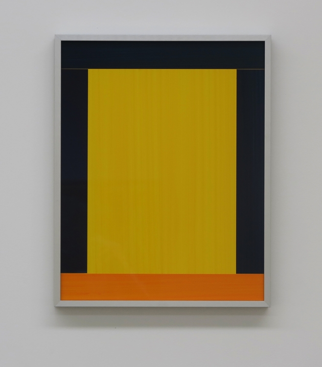
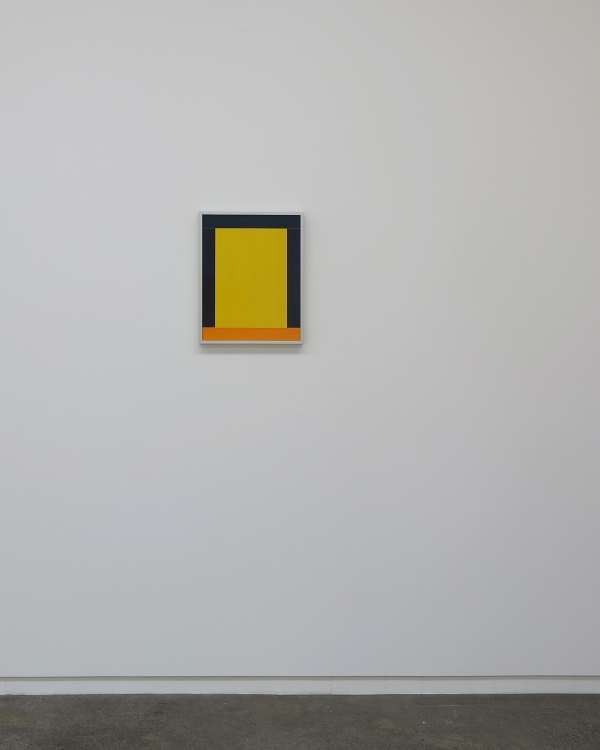
The three works on the two much shorter walls (Revolver Rot Gelb Blau; Before the Storm; Hello Darkness) - displayed opposite each other - in their comparatively subdued mood, have their traversing component bands either vertical or horizontal; and with slivers of colour playing peek-a-boo within the zones that separate the dominant modular blocks (at one gallery end rectangular; the other square). These structure each matrix like scaffolding, and while the works are more stable in terms of compositional movement, they are also more intricate. They are a little like Allen Maddox paintings, but with no St Andrew’s crosses (saltires), and no bent or splattery lines. And of course they are collages.
Before the Storm and Hello Darkness are simpler than Revolver Rot Gelb Blau, having fewer modules. They also have plainer flat fields (in their centres) that act as effective foils for the framing shards of piecemeal colour that border them. Central stability is presented against peripheral agitation; expansive air and light against density and compression.
In this context the Fishing works seem wildly restless and overtly energetic, with the slanted bands jitterbugging up and down and flipping around in their diagonal alignments. Instead of exploiting slivers of colour they use the corners and tips of each strip that peek out from behind the (often darker) closer bands. The direction of the brushed-on painterly grain accentuates the drama of these hyperactive vectors.
Here’s a little wild speculation, that the title Fishing Blue III was inspired by Henry Thomas’ 1928 version of Fishing Blues, found on Harry Smith’s influential Anthology of American Folk Music (1952), that is so beloved by people like Bob Dylan, Nick Cave, Tom Waits and others. The diagonals could subconsciously be fishing poles.
If like me, you are constantly fascinated by the spatial dynamics of colour, texture, alignment and shape, this is a very satisfying presentation, one that is exuberant and frenzied, but also contemplative and even introspective. Exploration of optical materiality at its best.
John Hurrell
 Advertising in this column
 Two Rooms presents a program of residencies and projects
This Discussion has 0 comments.
Comment
Participate
Register to Participate.
Sign in
Sign in to an existing account.