
John Hurrell – 24 January, 2017
Near the floor you see six plastic electrical boxes positioned apart for accessible power points. They are normally ‘invisible.' There are also uninvited visitors like daddy-longlegs spiders living in the corners, while (even stranger) the spatial attributes of the recessed band at ankle level (salient because of the horizontal shadow at its top edge) defy expectations - they flip to look like projecting skirting boards. The closer you look the odder normality becomes.
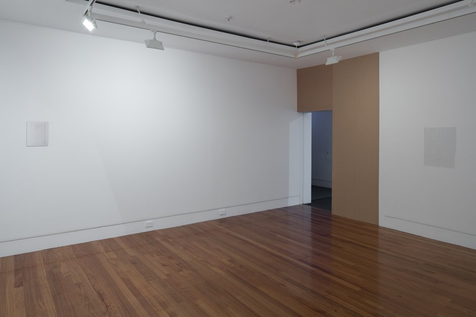
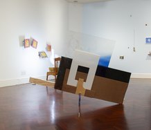
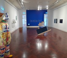
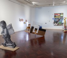
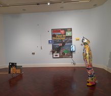
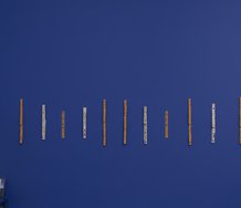
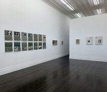
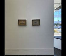
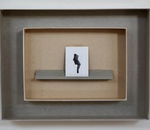
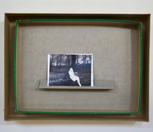
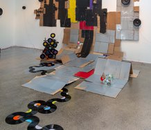
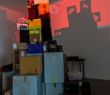
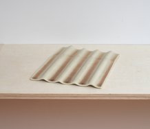
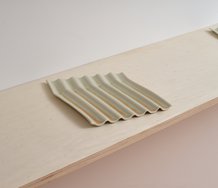
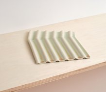
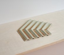
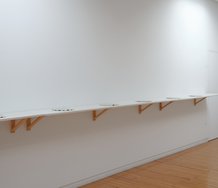
Reminiscent in its austere minimalism to some earlier Te Tuhi shows (such as one by John Ward Knox) in that very same white-cubed room, Katrina Beekhuis‘ spare presentation displays six unobtrusive (sometimes almost imperceptible) items, all separated by irregular intervals.
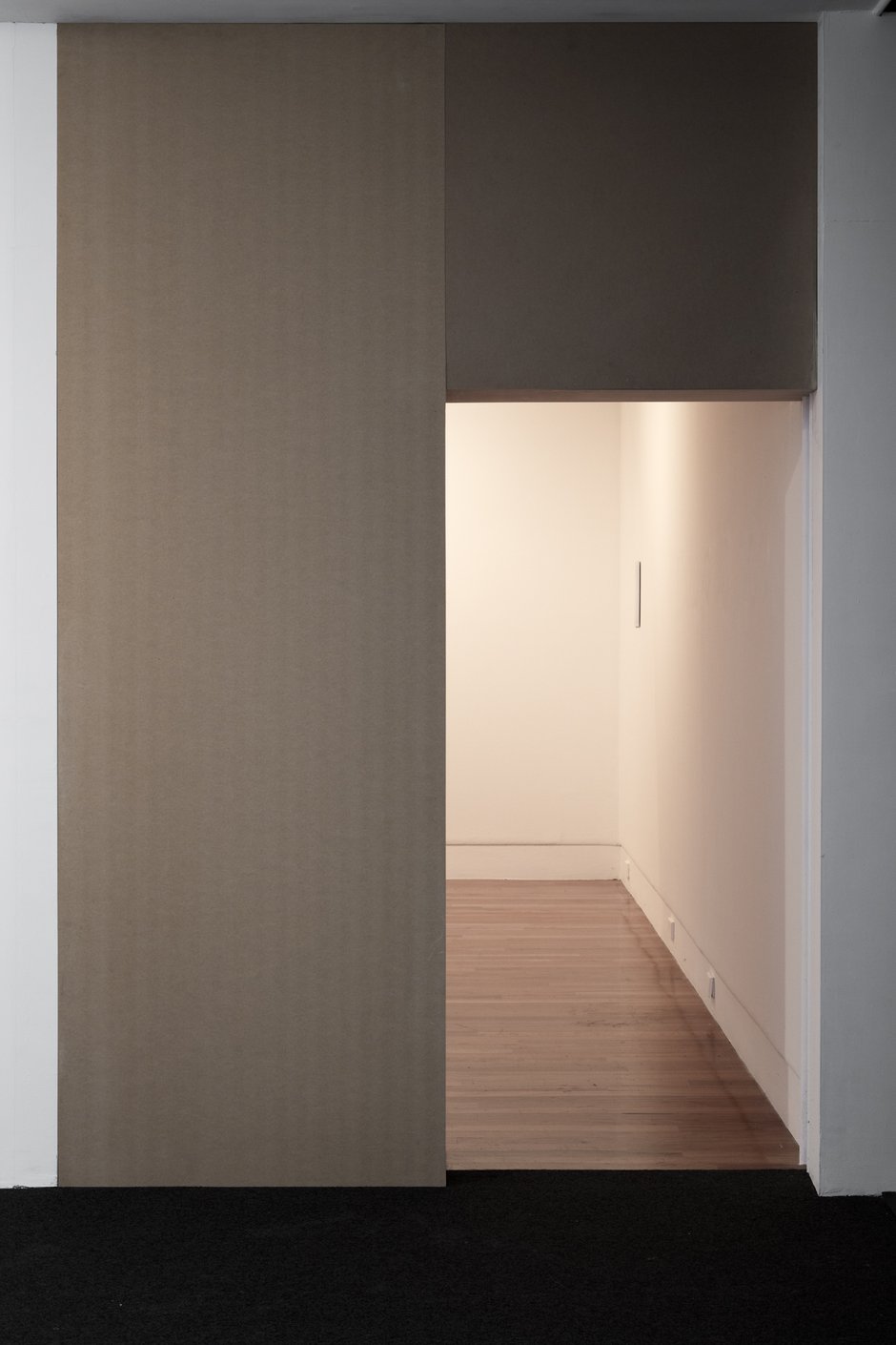
The ‘lintel’ and left-hand ‘support’ of the entrance to her exhibition are dominated by two fastidiously positioned MDF panels with subtly contrasting surface patterns and tones. Te Tuhi’s doorway has been expanded and then its width bisected by the vertical column, while the upper square is half the surface area of the rectangular entrance itself - a supremely elegant, classical solution.
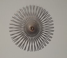
Next we see, around the corner on the wall, a delicate grid (drawing in space) made of fishing trace wire. The lines are joined up by heating the ends with a low burning flame so that the metal and nylon coating melt to become a sort of solder. The wobbliness of the wire brings its own sort of charm to the overall matrix.
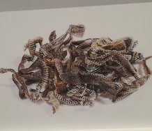
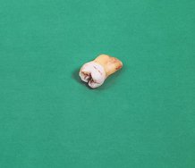
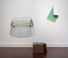
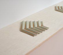
Leaning against the next wall - balancing on two legs - is an opened-out clothes drying rack that initially looks like a store-bought rack stripped of its coated white plastic. It seems to be carefully hand-made, with its different coloured metals and crooked lines. Hanging on a horizontal strut is a pair of children’s pants, with tapered legs that look like tights, and made of evanescent gauze so that it is practically invisible. Its twin pronged shadow on the wall is easier to detect.
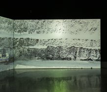
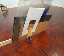
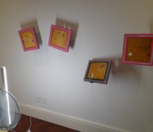
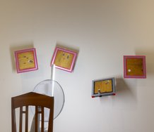
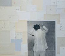
On the wall opposite the entrance we see what looks like a framed stretcher with the canvas unpainted. It is overlaid with a glass sheet that is hard to see unless you have the light at a convenient angle. When you do spot it (the glass), you wonder if it is in fact a photograph of a canvas. You also wonder about the materials of the frame -whether the wood listed refers to a section of spray-painted frame or to the hidden stretcher presenting the woven support.
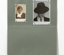
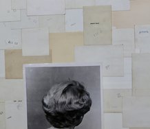
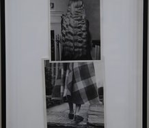
Finally, close by across the corner, on the last wall, is a photograph. It is of a watercolour painting of a flowering plant growing in a pot, and the medium is not obvious. The pale pink of the photographed painted wall provides the title of the show, Potters Pink, for Potter’s Pink is a variety of semi-transparent, lightfast, moderately subdued watercolour pigment. Potter’s Field is the ‘wild west’ term for a paupers‘ cemetery, and so I wonder if Beekhuis is making some sort of Barthesian statement about photographed beings and death (‘that-has-been‘) - or the related Sontag comment (‘photography is the inventory of mortality‘). More likely a coincidence.
Like any Billy Apple, Ruth Buchanan, Dane Mitchell or Matt Henry exhibition, this sort of show makes you look ultra carefully at the room: its surfaces and its finish; its quality of light. You start to notice variations in wall tactility, textural transitions from smooth sleekness to clusters of pit marks, or occasional striations. Near the floor you see six plastic electrical boxes positioned apart for accessible power points. They are normally ‘invisible.’ There are also uninvited visitors like daddy-longlegs spiders living in the corners, while (even stranger) the spatial attributes of the recessed band at ankle level (salient because of the horizontal shadow at its top edge) defy expectations - they flip to look like projecting skirting boards. The closer you look the odder normality becomes.
John Hurrell
 Two Rooms presents a program of residencies and projects
 Advertising in this column
This Discussion has 0 comments.
Comment
Participate
Register to Participate.
Sign in
Sign in to an existing account.