

John Hurrell – 14 November, 2012
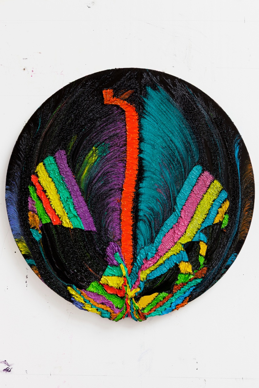
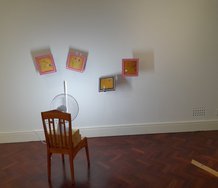
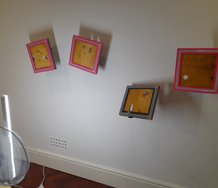
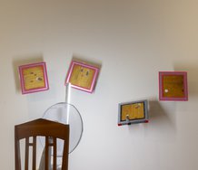
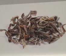
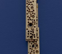
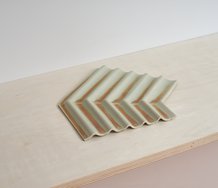
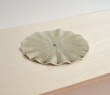
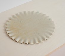
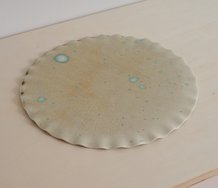
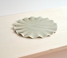
Tondos tend to be compositionally unstable compared to rectangles, so it is odd seeing the downward pull of gravity not being used as some sort of optical anchor. Here because Harding's squishy and angular fragmentation is multi-directional, it is not that obvious where the top is or where the original formation of stacked lines was located. It is thus a challenge to try and mentally reconfigure the tracks of his ripped apart and reconfigured linear elements.
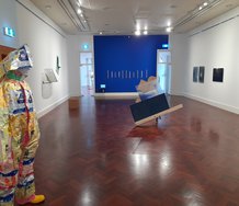
Alexis Harding is an English artist who emerged from Goldsmiths in the mid-nineties much admired for his innovative approach to paint, presenting it as a viscous substance that can be manipulated using gravity.
The works that initially brought him a lot of attention involved a procedure using acrylic gloss poured into a gridded partitioned tray laid over a thick bed of sticky oil paint on a rectangular canvas placed on the floor. After the tray was removed and the gloss paint partially dried, the work was hung on the studio wall. Sometimes the skin slid off the canvas, and sometimes after wrinkling, sagging and partially disintegrating, it remained - if the underlayer of oil paint oxidised and was sufficiently hardened.
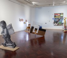
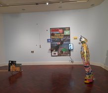
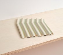
Whilst those works were rectangular, grid based, used gravity and usually an acidic colour sense, the current paintings upstairs at Two Rooms are mostly circular tondos, use sweet, spectrally organised, vertical bands of colour, and have been - to use Harding’s own words - ‘massaged or squeezed’.
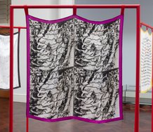
While I dislike Harding’s colour sense in these works - they are too overtly decorative (in a corny sense) and remind me of Jenny Kee scarves, I am fascinated by his method of using paint and how the sequence in the spectrum (the strata) later guides your analysis of the works’ formation. His process intrigues through the interaction of the two (chemically opposed) sorts of paint and the way the garish lines of glossy skin break up (manually induced) within a turbulent black sea of siky oil.
Tondos tend to be compositionally unstable compared to rectangles, so it is odd seeing the downward pull of gravity not being used as some sort of optical anchor. Here because Harding’s squishy and angular fragmentation is multi-directional, it is not that obvious where the top is or where the original formation of stacked lines was located. It is thus a challenge to try and mentally reconfigure the tracks of his violently shifted forms, the movement of his ripped apart and reconfigured linear elements.
Harding’s manual intervention here, the forced compression of parallel streams, the separation or mashing of bands so they are pulled apart and scattered, or conversely collide, loop over and jam up, is an unusual form of smeary gesture, using the palm and clenching fingers - not the brush. We see dark greasy traces of the pigmented ribbons’ sweeping trajectory as broken sections get swirled around like coloured sand in a bowl, or crunched up biscuits in a jar. The coaldust-like residues tailing behind Harding’s co-ordinated movements seem akin to the planned multi-armed trajectories of French painter Bernard Frize, but more abandoned and spontaneous, with a greater sense of sudden geological catastrophe.
Rarely in painting is the interaction of destructive and creative components so lucidly drawn out, the risk-taking akin to Francis Bacon and the squashing of form to the sculpture of John Chamberlain and César (both crushing car chassis). Despite my aversion to Harding’s choice of colours, I can see a logic in the way he makes you concentrate on the shapes and their origins, rather than chromatic sensation. He wants you to contemplate the history of the pieces of paint skin on the circular MDF, how they ended up where they are. To be a bit like a geologist analysing tectonic plates.
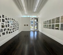
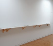
It’s wonderful to see a body of Harding works here in Auckland, and hopefully in the future we’ll see a bigger selection still in the downstairs Two Rooms gallery soon. In the meantime, this is an important show by an extremely accomplished painter - one not to be missed.
John Hurrell
Recent Comments
John Hurrell
Probably Callum Innes is the closest in terms of a subtractive process, but not so violent in mood - more ...
Owen Pratt
Nice site, shows Harding riffing on the themes. Echoes of Gimblett, 80's Bambury and Helen Calder.
John Hurrell
Well if you look at his website you'll see Harding tries out a lot of different colour combinations. http://alexisharding.com/. I ...
 Two Rooms presents a program of residencies and projects
 Advertising in this column
This Discussion has 4 comments.
Comment
Owen Pratt, 10:51 a.m. 14 November, 2012 #
Yes nasty colour but with such a physical approach to medium what chroma would be appropriate? Its an issue with much 'abstract' painting, why this colour and not any other.
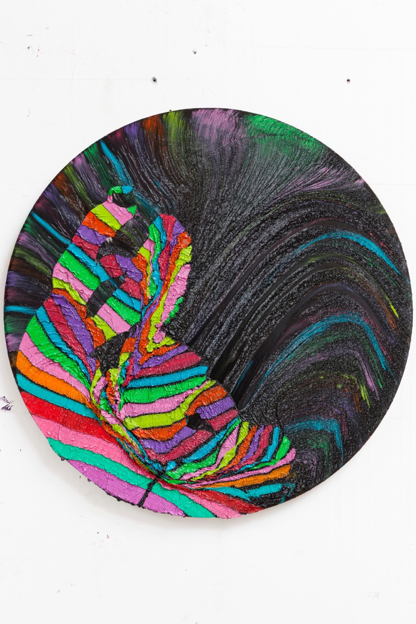
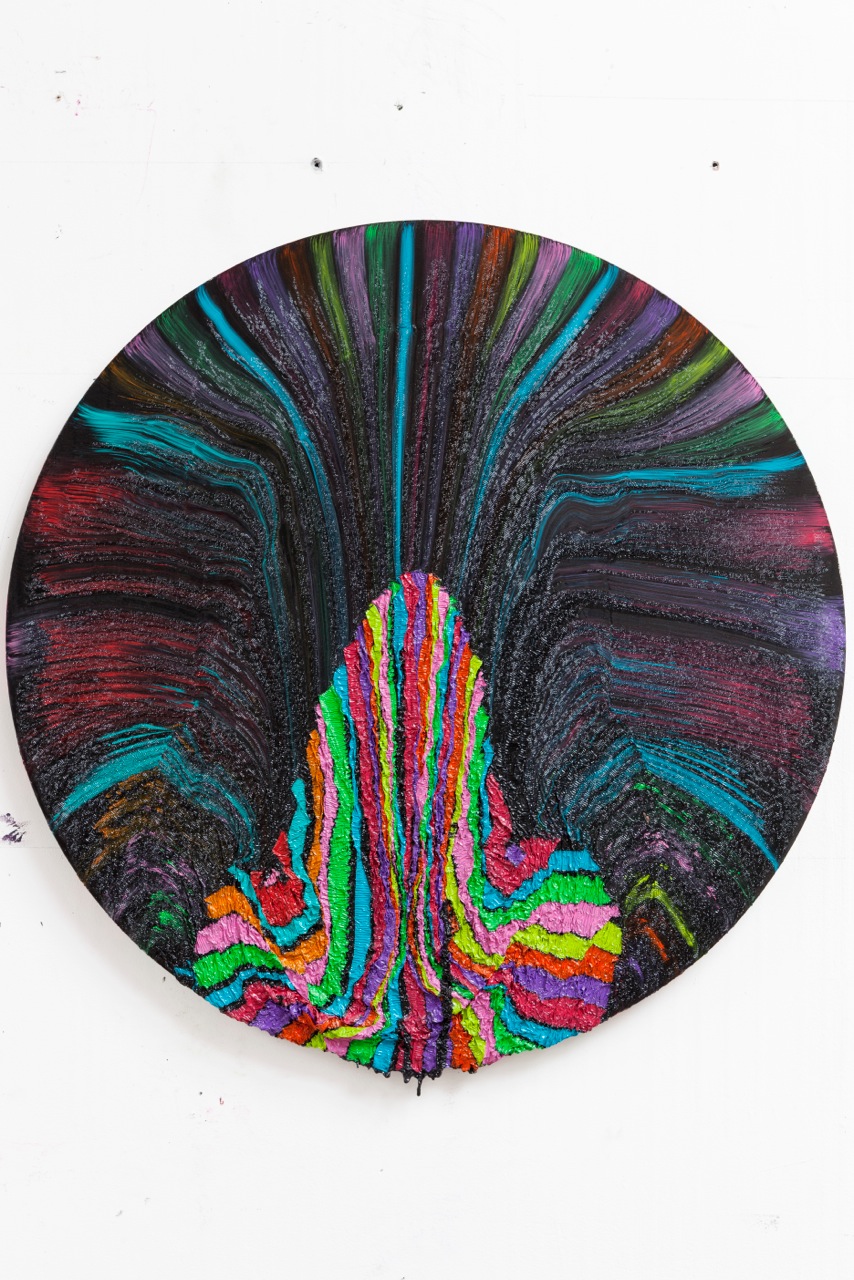
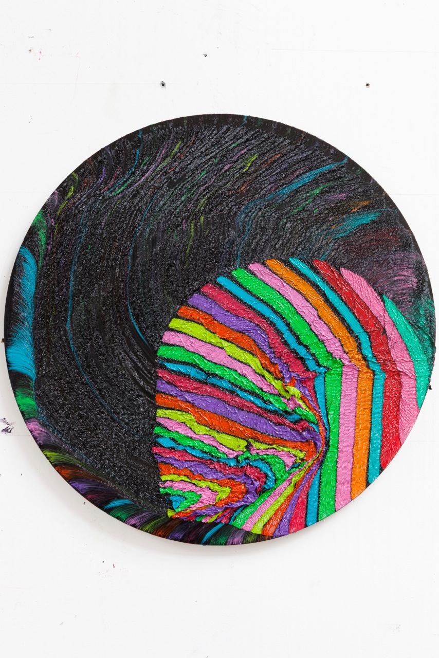
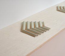
The last three images of the tondos would appear to be much the same, John in your opinion does this printerly, editioning of the paintings strengthen the idea or dilute? A focussed investigation, a cynical marketing strategy or simply professionalism?
John Hurrell, 11:16 a.m. 14 November, 2012 #
Well if you look at his website you'll see Harding tries out a lot of different colour combinations. http://alexisharding.com/. I think he can make some really unusual choices when he is interested in doing so. These works have the bands of colour stacked in a sequence so at the end of the process you have think about how the broken parts have been shifted.
The last three images are isolated parts of a triptych. They start from the left and so collectively make up a worked out composition. They go together. Sorry, having them separated and spread out is confusing.
Owen Pratt, 6:58 p.m. 14 November, 2012 #
Nice site, shows Harding riffing on the themes. Echoes of Gimblett, 80's Bambury and Helen Calder.
John Hurrell, 8:01 p.m. 15 November, 2012 #
Probably Callum Innes is the closest in terms of a subtractive process, but not so violent in mood - more classicist. Less turbulent. Using solvents not gravity (by itself).
I love Harding's quarrel and infatuation with the modernist grid, the way his rows of boxes warp, crumble and disintegrate.
Participate
Register to Participate.
Sign in
Sign in to an existing account.