
Andrew Paul Wood – 9 March, 2010
Most of the punk rocker vibe aesthetic that dominated his work throughout the 1990s and early 2000s was a kind of Magic Christian kind of trip …
Christchurch
Tony de Lautour
New Paintings: 2009-2010
March 2-27, 2010
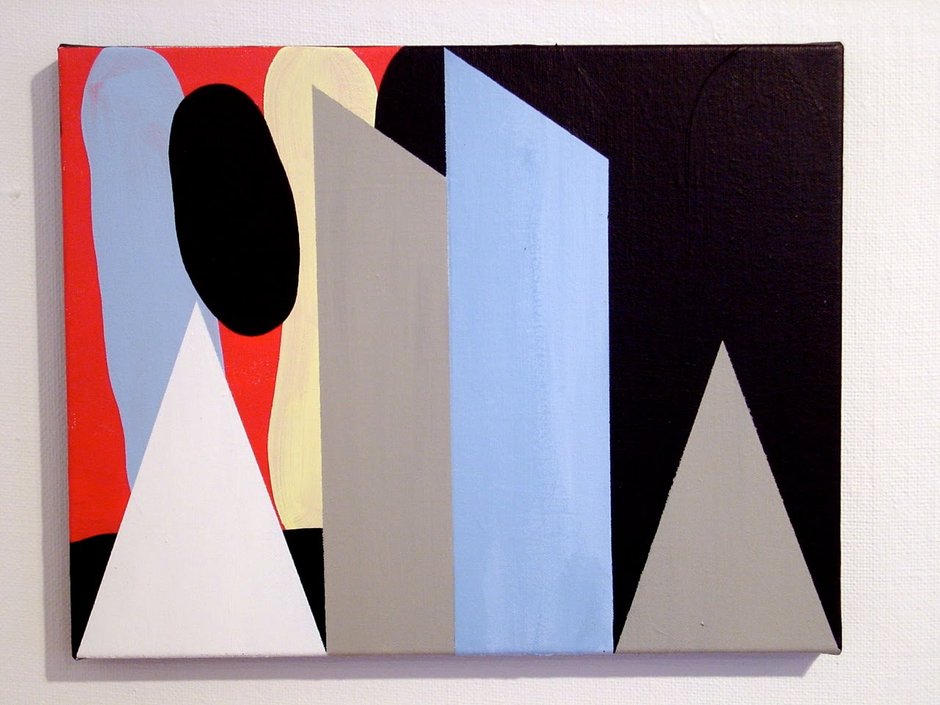
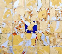
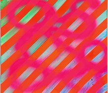
In Tony de Lautour’s work over the last two decades, there has been a discernable distancing from the figurative ‘lion and kiwi’ and mountainous logo years. In the last ten years this leaning to abstraction has resolved itself in two distinct and oppositional ways; an all-over decorative surface and a more constructivist approach.
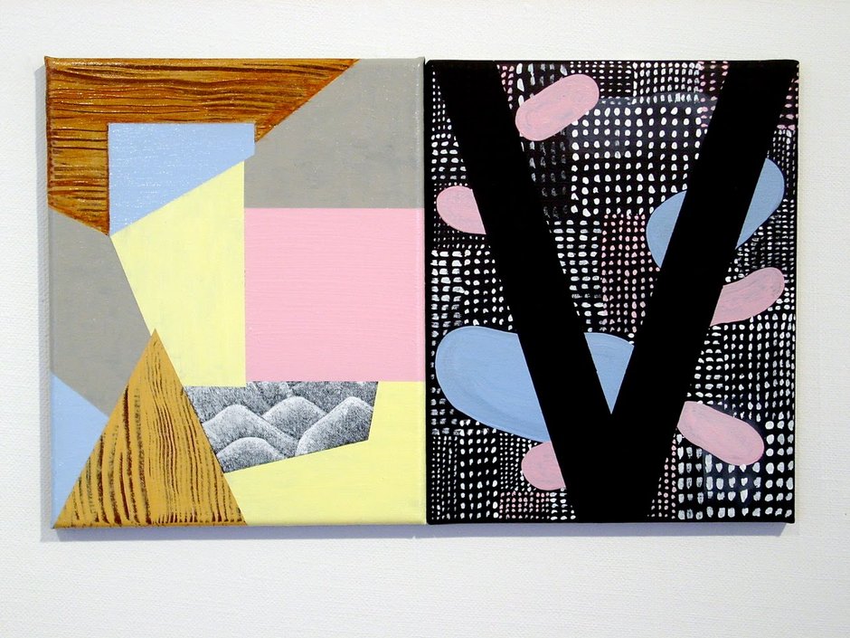
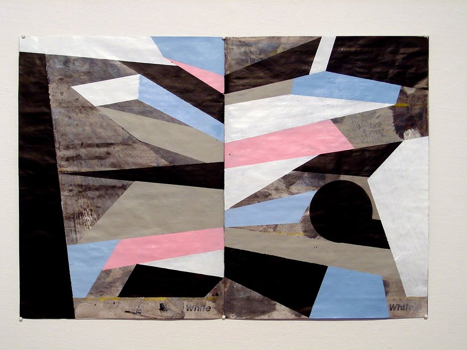
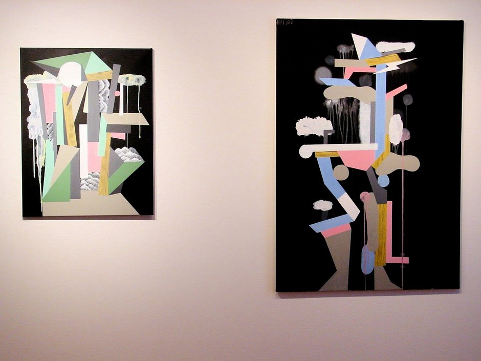
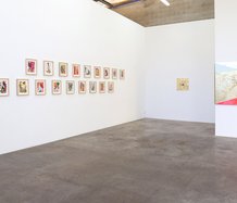
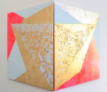
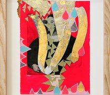
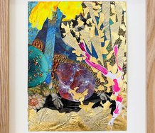
In Tony de Lautour: New Paintings 2009-2010, we see much of the latter. Frequently these are pop-cubist images reminiscent of the mid-period collaborations of Braque and Picasso, with familiar wood grain elements and a startling palette of Jeyes Fluid pink, pale lemon and eau-de-nil which is harmonised by the black backgrounds. Sometimes, as in Anna and Anita (the names of two friends) it is a stylised word that provides the composition. At other times there are references to the cubist collages of found items as in Spread, an overpainting of a real estate catalogue.
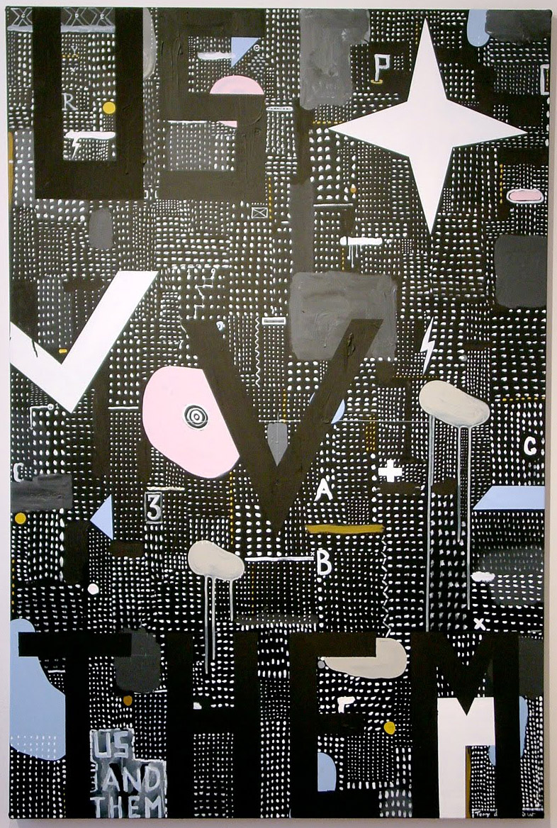
As if to give some context to these recent developments, the work Us v Them (named, true to de Lautour’s rock ‘n’ roll attitude, after a song by LCD Sound System) retains the black plane sprinkled with a grid of white dots like a cross between the Manhattan skyline at night and a Pac Man labyrinth. The symbols the artist once scattered through these grids have now become the dominant form. This is almost a revision and dissection of de Lautour’s past oeuvre, casting about the old lightning bolts, mashed potato alps and spiderwebs Killeen-wise, and mixing them up with Gordon Walters’ pitau forms and dribbling clouds that seem to recall Bill Hammond and John Pule. Of these latter forms, at the opening the artist mentioned to me that he thought that these had a resonance with Peter Robinson’s baroquely incontinent polystyrene sculptures.
In the painting Tower the symbols pile up in a tottering Tatlin-esque Tower of Babel (one is rather reminded of Maeterlinck’s The Blue Bird in which the souls of babies not yet born construct towers representing their future lives and vocations). The effect chimes with Pencil Case painter roots when one recalls the scaffolding/pigeon holes of Shane Cotton and the piled up portmanteaus of Seraphine Pick. It must also be remembered that de Lautour actually studied sculpture at Canterbury, which may explain something of this compositional trope.
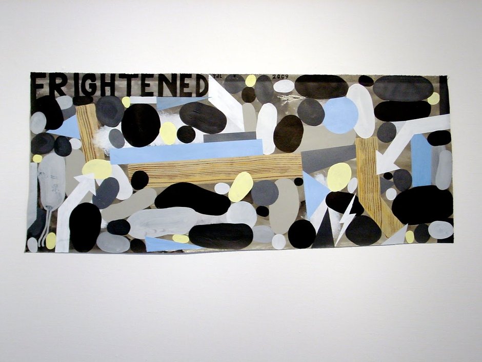
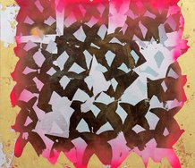
The all-over surface works, on the other hand, are more organic in their exfoliation of disc shapes. In both cases this would seem to be closely related to Deleuze and Guattari’s phenomenon of the “body without organs” - an anonymous and non-differentiated surface - to which various “desiring-machines” and “paranoiac machines” attempt to attach in “counter-investment” (investissement). The plane/ground becomes a socius as a full body, forming a surface: “where all production is recorded, whereupon the entire process appears to emanate from this recording surface” which is little more than a self-adjusting mirror to society, resulting in new syntheses.
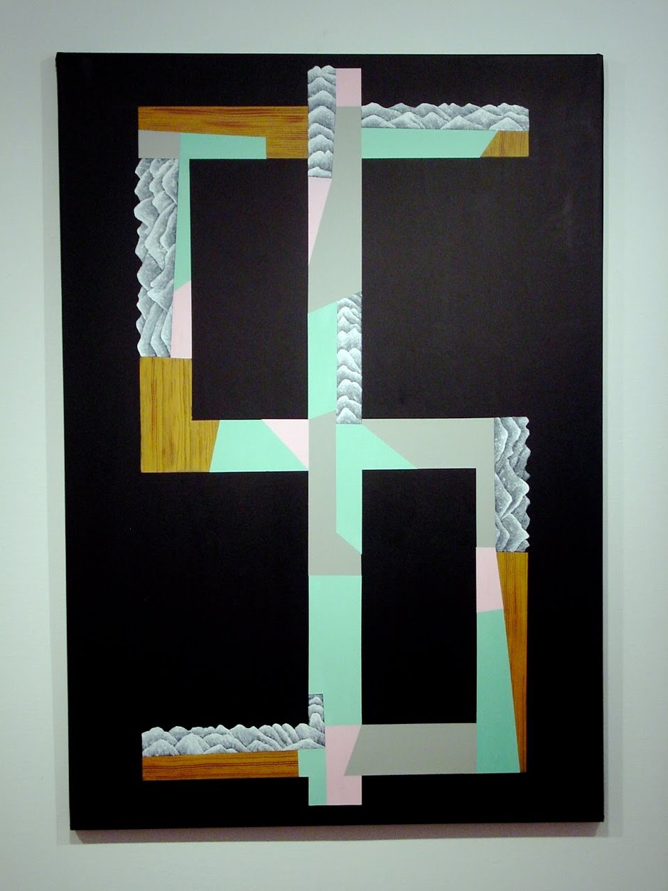
What is really most evident in these new works is that de Lautour has (dare I say it?) entered the mature phase of his career. Most of the punk rocker vibe aesthetic that dominated his work throughout the 1990s and early 2000s was a kind of Magic Christian kind of trip - pose as something other than a nice, middle-class white boy to lure the bourgeoisie into a psychic maze and then relentlessly bombard them with surreal and endlessly new experiences until they come around to your way of thinking. De Lautour seems, apart from the occasional miniature tattoo lightning bolt or spiderweb, the odd song reference in a title, to have taken up the call of a purely aesthetic approach to composition. The maze is now formal, visual, compositional, rather than political or philosophical. The emphasis is off the pop cultural tics and bad white art/rebel without a cause, and even the monochrome alp/logo inspired critiques of art/land commoditisation have retreated into the background - though something of that remains in one painting in the exhibition of a dollar sign.
This new work is quieter, more thoughtful, subtler and less striving for the currency of effect. Perhaps it is true of all painters that eventually composition ultimately becomes nothing more than an excuse to apply paint to a surface. But yet, this is no simplistic and reductive descent into pure abstraction - the work remains resolutely and recognisably de Lautour (despite his occasional magpie cherry-picking of other artists’ leitmotifs) - and to me (and the audience, the connoisseurs, the market) that is what is truly important.
Images courtesy of the artist.
 Two Rooms presents a program of residencies and projects
 Advertising in this column
This Discussion has 0 comments.
Comment
Participate
Register to Participate.
Sign in
Sign in to an existing account.