
John Hurrell – 6 December, 2009
It generates open abstract forms packed with wiggling wormlike strokes. These teeming pockets of energy seem connected to Pat Hanly’s ‘Molecular’ paintings of the seventies inspired by Blake, Huxley and lysergic acid.
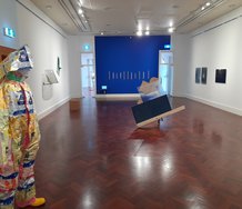
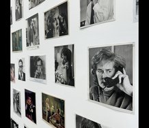
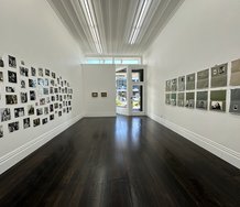
Nine artists connected to the Antoinette Godkin gallery present old and new work to be perused over the Christmas holidays. No prints or photography, mainly abstract paintings and drawing.
While the Godkin regulars here do provide excellent contributions, there are few surprises. Andre Hemer has a characteristic predominantly yellow and red canvas laden with vigorous computer-stored gestures and negative slashes, while Miranda Parkes has one of her large, striped, voluminous canvases - plus two small paintings with glued on paint fragments. Though they have been shown before, Esther Leigh has some superbly elegant milky/pink works of translucent film and ink on reflective mirror.
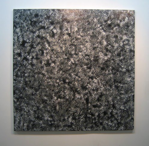
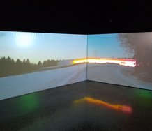
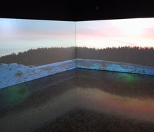
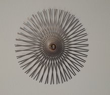
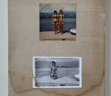
The startling revelations (for me) come from paintings, such as the predominantly blue, shimmering abstraction by Sue Novell, based on a landscape photograph processed digitally. It generates open abstract forms packed with wiggling wormlike strokes. These teeming pockets of energy seem connected to Pat Hanly’s ‘Molecular’ paintings of the seventies inspired by Blake, Huxley and lysergic acid.
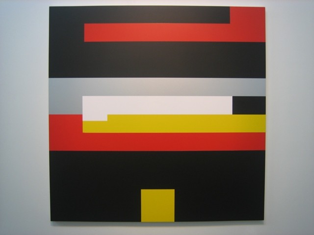
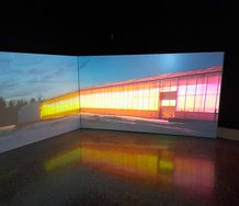
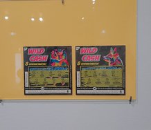
Andy Tolhurst has two wonderfully pristine vinyl ‘paintings’ as well, crisp geometric compositions related to Matt Mulligan or Peter Halley. One is based on a squashed Lion Beer label found on the footpath. Its red, grey, black, white and yellow colours have been applied to a squared-off Gordon Walters-like ‘koru’ structure with the panel’s vertical proportions divided into thirds and then sixths. The other work is an elegant arrangement of carefully selected squared signs taken off Japanese noodle packets and placed onto a silvery field.
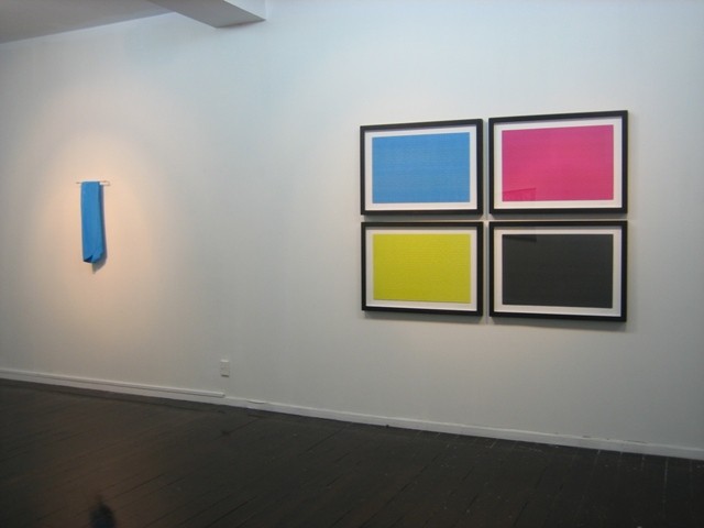
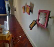
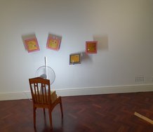
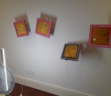
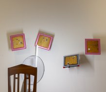
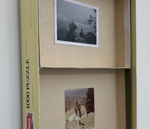
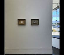
James R. Ford presents four mono-coloured rectangular jigsaws, under glass with thick black frames. They use colour from colour printing (demonstrating what is termed ‘subtractive’ for the mixing of absorbed light) to reference the three primaries (cyan, magenta and yellow) and the result of their mixing (black). There is a strange humour implied by the interlocking jigsaw pieces because these separate colour units would work only by juxtaposition. This would inevitably result in grey (not the commonly expected secondary hues that come from overlaying and transparency). Perversely, the proportions are those of landscape painting (a different principle again from mixing light [‘additive’ from reflected colour] and printing with separated primaries).
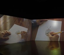
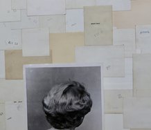
Ford’s use of jigsaw modules has links with the drawings of Carol Fletcher who repeats tracings of details from discarded wrappers or her own drawings, to construct gridded rectangles with rows of repeated units. These she covers with liquid wax.
Whilst there is a certain droll humour in making faint pencil drawings out of rubbish, that reference industrial mechanization and artists like Warhol, the stacked images seem too understated to me, and not obsessive enough. They need to be more extreme, to be in their thousands, not just under a hundred.
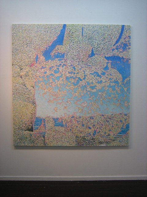
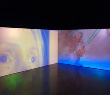
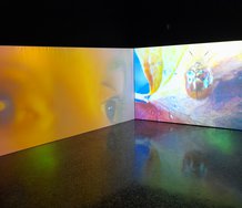
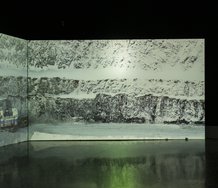
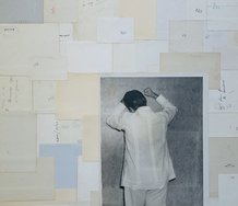
Matthew Dowman makes more convincing works with tone rather than colour in my view, especially with his complicated swirling nets of stencilled and airbrushed black and white lines, overlaid with toothbrush-flicked fine mists. They create considerable impact with their different points of density and clashing directional alignments; so that whilst almost chaotic, they still retain order and invite mental immersion.
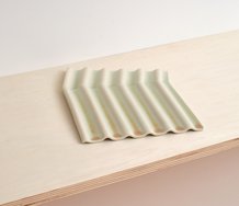
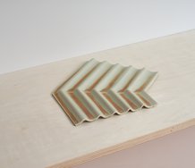
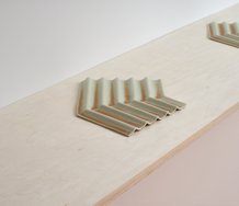
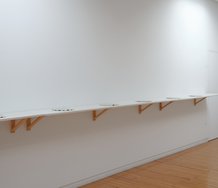
Helen Calder’s painting/sculpture of a peeled-off, blue, acrylic/enamel hide hanging off a short rail doesn’t have the impact of the works in her recent City Art Rooms show. The pleasure found in her painting is in the striated, pitted textures of the surface and its edges, so when that skin is repeatedly folded over those chances for scrutiny disappear. A wide fleece then becomes a narrow towel or floppy shower mat in a hotel bathroom, and while such humour about painting’s social after-effects might be intended, I suspect not. The ambiguous, possibly utilitarian function of the portable and very rubbery ‘painta-derm’ in an architectural setting is not really anticipated as a question.
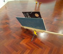
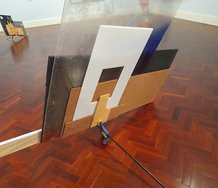
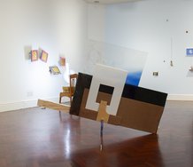
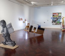
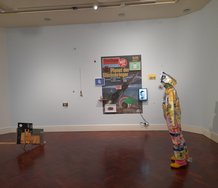
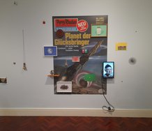
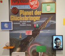
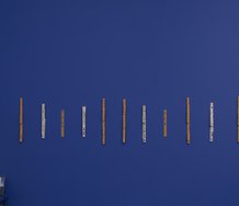
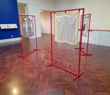
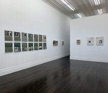
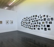
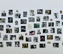
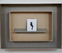
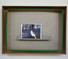
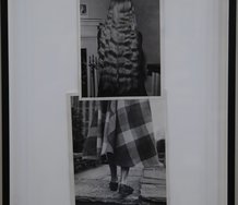
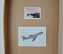
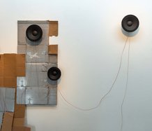
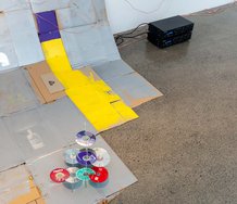
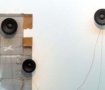
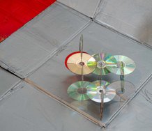
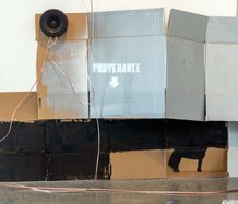
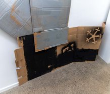
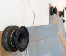
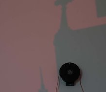
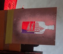
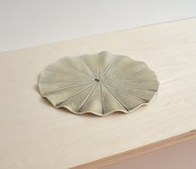
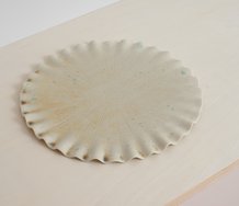
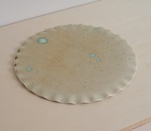
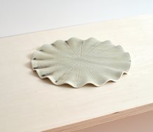
Images of works by Andre Hemer, Sue Novell, Andy Tolhurst (2), Matthew Dowman (2), and Helen Calder alongside James R.Ford. In descending order.
 Two Rooms presents a program of residencies and projects
 Advertising in this column
This Discussion has 0 comments.
Comment
Participate
Register to Participate.
Sign in
Sign in to an existing account.